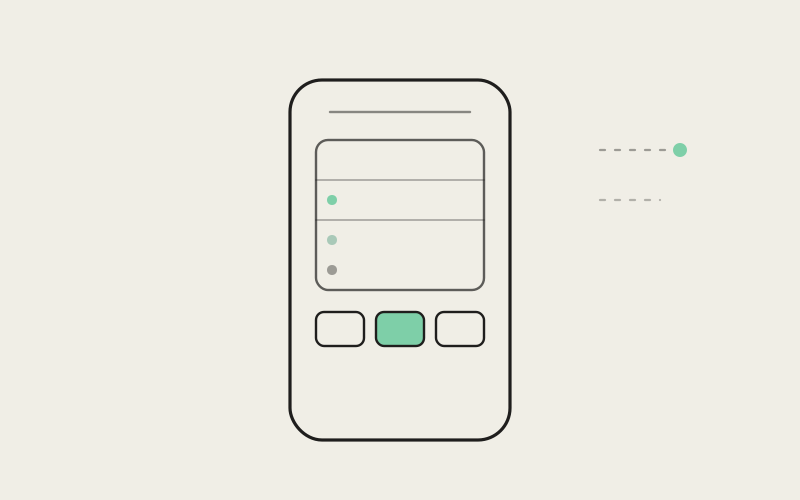
A desktop running Influxx can have a dozen things happening at once — several coding agents working in parallel across different projects, tasks queued up behind them, more than one connected account routing work to different places. Checking in on all of that from a phone used to mean hunting: one screen for what's running, another for what's waiting, a third for what's connected to what. Influxx Mobile's restyled workspace screen collapses that hunt into a single view with clearly labeled tabs underneath it, so someone can look at their phone for ten seconds and actually know what their desktop host is doing.
A Cockpit in Your Pocket Is a Real Information-Architecture Problem
The desktop side of Influxx is deliberately built as a cockpit — a single place where a developer can see and steer everything happening across the coding agents they're running, whatever CLI is powering each one, whatever project each is touching. That works on a desktop because a desktop has room: a wide display, multiple panes, a keyboard for fast navigation between them. None of that room exists on a phone. A workspace screen on mobile has maybe five or six inches of vertical space to convey the same underlying complexity that the desktop spreads across an entire monitor, and it has to do it for someone who's very likely glancing at their phone for a few seconds between other things, not sitting down for a focused session.
That constraint is the actual design problem, and it's a harder one than it sounds. The instinct when you're squeezed for space is to compress — shrink everything, cram it in, trust that people will scroll and tap their way to what they need. We think that instinct produces exactly the wrong outcome for this particular screen, because the entire value of checking a workspace from your phone is speed. If understanding what's happening on your desktop from mobile takes longer than just walking back to your desk, the feature has failed at its one job regardless of how much information it technically displays.
Why an Undifferentiated Feed Doesn't Work Here
The simplest version of a mobile workspace screen is a single scrolling feed — agents, tasks, and account activity all interleaved in one list, sorted by recency. We considered that shape seriously, because it's the shape a lot of mobile apps default to, and it has real appeal: one list, one scroll gesture, nothing to choose between.
It falls apart specifically because the three categories of information don't answer the same question. An active agent session is answering "what's happening right now." A pending task is answering "what's waiting for a decision or hasn't started yet." A connected account is answering "what's this desktop host actually able to reach." Those are three different mental models, and flattening them into one feed doesn't simplify anything — it just forces someone to do the categorizing themselves, in their head, while scanning a mixed list under time pressure. A feed that saves the product from making a decision about structure just pushes that decision onto the person using it, at the exact moment they have the least patience for making it.
"We prototyped the single-feed version first, honestly, because it's less work to build. The problem showed up immediately in testing — people would open it looking for one specific thing, a task they knew was pending, and they'd have to read past agent activity and account status to find it, even though none of that surrounding noise was what they came for. Splitting it into separate tabs wasn't a nice-to-have polish pass. It was the fix for a real comprehension problem."
— Sofia Marchetti, Desktop Platform Engineer, Influxx
Three Tabs, Three Clearly Labeled Surfaces
The restyled workspace screen splits into three tabs sitting directly beneath the main view: agents, tasks, and accounts. Each one is scoped to a single question, and none of them try to also cover what the others already handle.
Agents: What's Actually Running Right Now
The agents tab is the "is anything happening" view — every active coding agent session tied to the current host, at a glance, without needing to open each one individually to find out if it's still working or already finished. This is the tab built for the most time-pressured version of checking in: someone pulls out their phone specifically to see whether a session that was running is still running, or whether it wrapped up and is waiting on them. It answers that one question as fast as possible and gets out of the way.
Tasks: What's Waiting on a Decision
The tasks tab is deliberately separate from the agents tab, even though tasks and agent sessions are obviously related, because "what's active" and "what needs me" are not the same question, and conflating them buries the more urgent one. A task waiting on approval or a decision is a call to action; an agent quietly working in the background usually isn't. Splitting them means someone can open the tasks tab specifically when they want to know "is anything blocked on me," without having to mentally filter out everything that's just running normally.
Accounts: What This Host Can Actually Reach
The accounts tab covers the connections a given desktop host has set up — the services and destinations that agent work can route through. It's the least time-pressured of the three tabs, which is exactly why it's kept separate rather than folded into the others: account and connection state doesn't change minute to minute the way agent activity does, and mixing a slow-changing category in with two fast-changing ones would mean the parts of the screen someone actually needs to check frequently keep getting diluted by information that rarely does.
"I run a handful of agents across two projects most days, and before this update I'd genuinely lose track of which one I'd checked on already when I looked at my phone. Now I open the agents tab, see what's running, and if I want to know whether anything's waiting on me I flip to tasks. It sounds like a small change but it's the difference between actually trusting the phone view and just using it as a reminder to go check my laptop instead."
— Grace Whitfield, engineering manager running a distributed team, Influxx user
Echoing the Cockpit Without Copying the Desktop
The mobile workspace screen is explicitly meant to echo the spirit of the desktop cockpit — one place that shows you everything happening — without literally trying to be the desktop cockpit shrunk down to fit a smaller screen. Those are different goals, and conflating them is a common trap in cross-platform product design: the desktop's density and its exhaustive feature surface are strengths there because a desktop has the space and the input tools to support them, but the same density on mobile stops being thoroughness and starts being clutter.
What we kept is the underlying principle: a single, coherent place to understand what's going on, rather than several disconnected screens someone has to visit separately and mentally stitch together. What we deliberately didn't try to keep is desktop-level density on a phone-sized screen. The tabs are the mechanism that lets us hold onto the first goal without chasing the second — agents, tasks, and accounts are still one workspace, reachable from one screen, but each surface stays legible at a glance instead of trying to show everything the desktop shows, all at once, in a much smaller space.
"The failure mode we were most worried about wasn't 'mobile doesn't do enough.' It was 'mobile tries to do everything and ends up doing all of it poorly.' A cockpit on a nine-inch phone screen that tries to match a cockpit built for a thirty-inch monitor isn't ambitious, it's just cramped. We wanted the mobile workspace to feel like the same product philosophy at a different scale, not a compressed port of every desktop feature."
— Marcus Idehen, Director of Product Engineering, ETAPX
What Deliberately Didn't Make the Cut
Being honest about scope means naming what got left off mobile on purpose, not just what got included. A meaningful set of desktop cockpit capabilities only make sense with a full keyboard and a large display, and we didn't try to force them into a phone-sized interaction model just for completeness.
- Direct, character-by-character editing inside a running agent session. Steering an agent's actual working context — reviewing and editing code inline, making granular corrections mid-session — depends on precise text input and screen space that a touchscreen genuinely can't match. Mobile lets you see status, approve or redirect at a high level, and jump back into the desktop session when finer control is actually needed.
- Side-by-side, multi-pane views of several agent sessions at once. The desktop cockpit's ability to watch several sessions simultaneously in adjacent panes depends on horizontal space mobile simply doesn't have. On mobile, you look at one thing at a time, by design, rather than a cramped attempt at the same multi-pane layout squeezed onto a single small screen.
- Deep project configuration and detailed connection setup. Anything that involves a long form, multiple nested settings, or careful one-time setup work is left for the desktop, where it can be done properly with a keyboard and enough screen space to see the whole picture, rather than rushed through on a touch keyboard.
None of these are omissions we consider temporary gaps to fill in eventually. They're the boundary of what a companion app is for, held deliberately rather than apologetically.
A Companion, Not a Replacement
It's worth stating the scope decision plainly rather than letting it stay implicit: Influxx Mobile is a companion for staying informed and taking quick action, not a full desktop replacement, and the workspace screen's design reflects that on purpose. Every decision in this redesign — the three tabs, what's on each of them, what got left off entirely — was made in service of that scope, not despite it. A mobile cockpit that tried to be a full desktop replacement wouldn't just be over-ambitious; it would actively work against the thing mobile is actually good for, which is a fast, low-friction way to know what's going on and nudge it in the right direction from wherever you happen to be.
An Honest Limitation
The tab split solves the comprehension problem, but it introduces a smaller one worth naming directly: something that touches more than one category — an agent session that's blocked specifically because it's waiting on an account connection, for instance — doesn't have one obvious home, and right now it shows up in more than one tab rather than being unified into a single cross-cutting view of "here's the one thing actually blocking your work end to end." For most day-to-day checking-in, that's a minor cost. For the less common case where a problem genuinely spans agents, tasks, and accounts at once, it means piecing together the full picture still takes a little more navigating between tabs than we'd ideally like. We think the trade-off is the right one for now, but it's a real one, not a hypothetical.
Frequently Asked Questions
What does the workspace screen in Influxx Mobile actually show?
A single view of everything happening on a connected desktop host, split into three tabs — agents, tasks, and accounts — so you can see active agent sessions, pending tasks waiting on a decision, and connected accounts without navigating through separate menus for each.
Why are agents, tasks, and accounts separated into different tabs instead of one feed?
Because they answer different questions — what's running right now, what's waiting on you, and what this host is connected to — and mixing them into a single interleaved feed forces you to mentally sort through unrelated information just to find what you actually came to check.
Can I edit code or fully control an agent session from the mobile workspace screen?
You can see status, review what's happening, and approve or redirect at a high level, but granular, character-by-character editing inside a running session is intentionally left to the desktop, where a keyboard and larger screen make that kind of precise control practical.
Is Influxx Mobile meant to replace the desktop cockpit?
No, and we don't design it as if it were trying to. It's built as a companion for staying informed and taking quick action from your phone — the workspace screen deliberately leaves out desktop capabilities that only make sense with a full keyboard and a large display, rather than cramming a compressed version of everything onto a phone screen.
What happens if a problem spans more than one tab, like an agent blocked by an account issue?
Right now, that kind of cross-cutting issue can show up across more than one tab rather than being unified into a single combined view — a real, acknowledged limitation of splitting the workspace by category rather than a gap we're pretending doesn't exist.
Do I need to be near my desktop for the mobile workspace screen to be useful?
No. It's built specifically for checking in from wherever you are — the point is understanding what's happening on a desktop host without needing to be sitting in front of it.
How is the mobile workspace screen different from the desktop cockpit view?
It shares the same underlying principle — one place that shows you everything happening — but it's built around what actually works at phone scale: three focused, clearly labeled tabs instead of the dense, multi-pane layout the desktop can support with a full keyboard and a large display.
The workspace screen isn't trying to prove that a phone can do everything a desktop can. It's trying to prove something narrower and, we think, more useful: that a phone can tell you the truth about what's happening on your desktop, quickly and clearly, without pretending to be something it isn't. Three tabs instead of one undifferentiated feed is a small structural choice. What it buys is the ability to glance at your phone for a few seconds and actually know what your desktop host is doing — which, for a companion app, is the whole point.