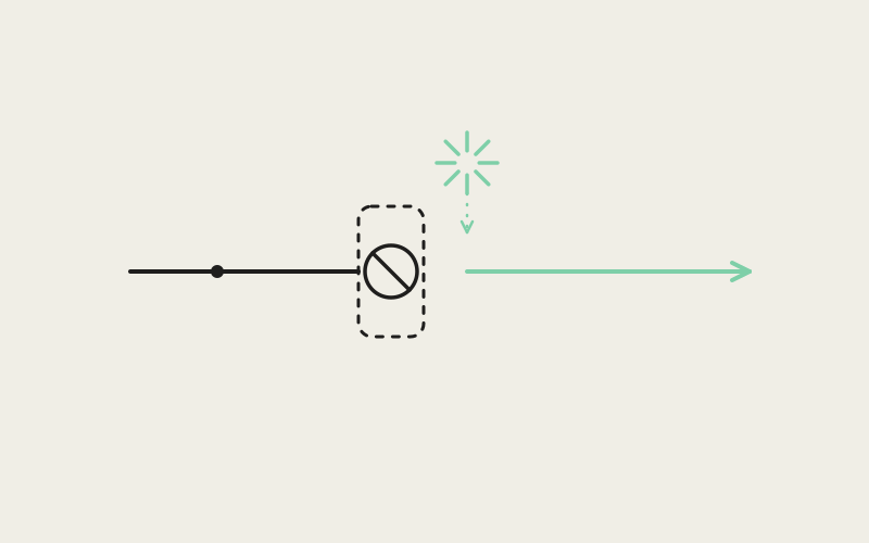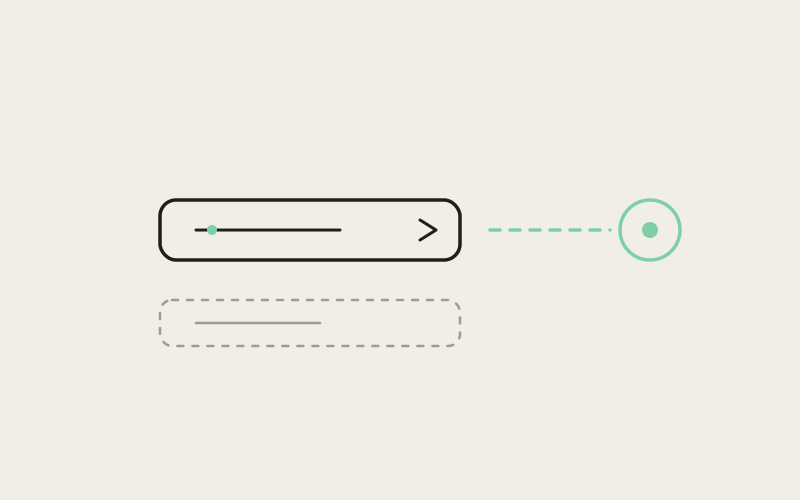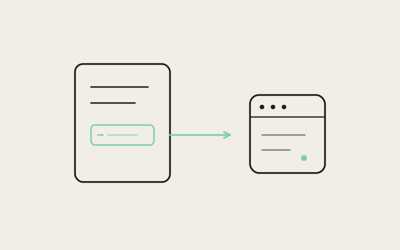
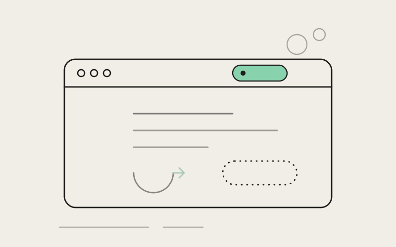
You're three sentences into an instruction for an agent, or halfway through comparing two branches, when a window slides over everything and asks whether you'd like to update now, later, or never — and won't let you touch anything else until you answer. Somewhere along the way, that became normal. In Influxx, a new version doesn't announce itself like that. It shows up as a small, quiet pill in the corner of the window, and it waits there until you decide to look.
The Popup That Always Picks the Worst Moment
There's a specific kind of interruption that update dialogs are famous for: they arrive with no sense of what you were doing. You could be typing the one sentence you finally figured out how to phrase, or watching an agent's output scroll past at the exact moment it matters, and the app decides that now is the time to plant a modal window directly in front of everything and wait for you to click something before you're allowed to keep going.
It's a small thing, technically. One click, and the dialog is gone. But the cost isn't the click — it's what the click costs you. Whatever you were mid-thought on has to be held in your head while you deal with something that has nothing to do with your work, and by the time you're back, the thread you were following has usually gone a little cold. Multiply that by every tool on the machine that thinks its update matters more than what you're doing, and it adds up to a familiar, low-grade irritation: software interrupting you to tell you about itself.
None of this is really about updates being bad. Keeping software current is good and mostly uncontroversial. The problem is the delivery — a full-attention demand for something that, in almost every case, could just as easily wait until you're between things.
A Small Pill Instead of a Big Interruption
Influxx's answer is deliberately unglamorous: a pill-shaped indicator that appears in the window's chrome — the same strip along the top where you'd already glance to check a tab or a project name — when a new version is ready. It doesn't move. It doesn't flash. It doesn't grow or pulse to get your attention. It just sits there, the way a small light on a piece of hardware sits there, present and legible if you happen to look, invisible in every way that matters if you don't.
That's the whole design. No dialog opens on top of your work. No focus gets stolen from whatever field your cursor is in. Nothing pauses what you're doing to make sure you've registered that an update exists. The pill is information sitting in your peripheral vision, not a claim on your attention.
The shape matters more than it might seem. A pill reads as calm — a rounded, low-contrast label, not a badge screaming a number, not a red dot demanding to be cleared. It's built to look like part of the interface rather than an alert layered over it, because that's precisely the distinction that decides whether something feels like a notification or an interruption.
What Updating Actually Feels Like Now
Here's the sequence, end to end. You're working. At some point, whenever it happens to catch your eye — after you finish a task, while you're waiting on a long-running agent, first thing when you sit down in the morning — you notice the pill. You click it whenever that moment comes, not because anything forced the timing. The update happens, and you keep going.
What's conspicuously absent from that sequence is a forced restart mid-thought. You're not asked to close what you're doing right now so the app can update itself. You're not presented with a countdown, a "restarting in 10 seconds" warning, or a choice between "update now" and "remind me in an hour" that just relocates the interruption instead of removing it. The update happens on your terms, at a point you picked, because you were ready — not because a timer ran out or a dialog wore you down.
That distinction — a click when convenient versus a dialog that insists — is really the entire feature. Everything else is in service of making that click as easy to find, and as easy to ignore, as it needs to be.
"Most update prompts are designed from the app's point of view — the thing the software wants is for you to update, so it interrupts until that happens. We wanted to design from the other direction: what does the person actually need in this moment, and it's almost never 'stop what you're doing right now.' A pill you can glance at costs you nothing until you choose to spend attention on it. That's the bar we held it to."
— Devon Okafor, Design Systems Lead, Influxx
Designed to Wait, Not to Nag
It would have been easy to build a quieter dialog instead of removing the dialog altogether — a smaller popup, a toast that fades after a few seconds, something gentler but still fundamentally interruptive. We didn't go that direction, because the goal wasn't a softer interruption. It was no interruption at all, for as long as you don't ask for one.
That means the pill doesn't escalate. It doesn't get bigger or louder the longer you leave it there. It doesn't start reappearing more insistently after a few days, or eventually corner you into a dialog anyway once enough time has passed. If you don't click it today, it looks exactly the same tomorrow — patient, present, entirely willing to wait for you rather than the other way around.
That patience is the actual design decision, more than the pill shape or the placement. A lot of "non-intrusive" notification patterns quietly give up on being non-intrusive after some threshold — they start as a calm badge and end as a nag screen once the product team decides enough time has passed. Ours doesn't have that ceiling. The version that shows up on day one is the same version that shows up on day thirty.
The Trade-Off: Quiet Enough to Miss
We think it's worth being straightforward about what this costs, because it does cost something. A notification designed to never demand your attention is, by construction, a notification some people will go a while without noticing. If you don't happen to glance at that part of the window for a stretch of days, you can be running an older version without it ever crossing your mind — not because anything is broken, but because nothing ever insisted otherwise.
That's a real trade-off, not a hypothetical one, and it's one we made on purpose. The alternative — a dialog that keeps resurfacing until you comply, or an update that installs itself and restarts the app whether you were ready or not — guarantees people stay current faster. It also guarantees that everyone eventually gets interrupted at a bad moment, because a large enough population of users means someone is always mid-task when the dialog decides to show up. We chose to protect the moment over the metric. Slower, broader adoption of a new version, in exchange for never once cutting off someone's train of thought to get there.
If you're the kind of person who wants to be nudged, even mildly, until you update — this isn't built for you, and that's a fair thing to know going in. It's built for the opposite instinct: never interrupt, even at the cost of some people running yesterday's version for longer than they realize.
"I didn't even clock that Influxx had updated for almost two weeks — I just happened to glance up at the chrome one day, saw the pill, and clicked it between two sessions. Compare that to basically every other app on my machine, where updating means stopping whatever I'm doing to deal with a dialog that showed up uninvited. I'll take the two weeks."
— Priya Bhatt, full-stack developer, Influxx user
A Day With the Pill
Picture a fairly ordinary morning. You open your laptop, Influxx is already running from yesterday, and you glance at the top of the window out of habit while your coffee's still too hot to drink — that's when you notice the pill sitting quietly next to your tabs. You don't click it yet. You've got a message from a teammate about something that broke overnight, and that comes first.
Twenty minutes later, you've handed that off to an agent to investigate and you're waiting on its first pass. This is the gap — the small, dead-air moment between starting something and it finishing — where the pill actually gets clicked most often, because there's genuinely nothing better to do with those thirty seconds. You click it, the update runs, and you're back to checking on the agent's progress before you've even really shifted your attention away from your original task.
Later that day, a different scenario: you're switching between two projects, showing a teammate a change you just made in one of them. If the pill had turned into a dialog at that exact moment — screen-sharing, mid-explanation — it would have been the worst possible instant for software to demand a decision from you. Instead, nothing happens. The pill is still there when you get back to your own screen, exactly where you left it, no worse for having been ignored during a moment that mattered more.
None of these are dramatic scenarios. That's rather the point — the feature's entire job is to be irrelevant to the vast majority of moments in your day, and quietly available in the handful where you have room for it.
Frequently Asked Questions
How do I know when there's an update available in Influxx?
A small pill-shaped indicator appears in the window's chrome — the strip along the top of the app — when a new version is ready to install. It doesn't open a popup or interrupt what you're doing; it's simply there to notice when you look.
Will Influxx force me to update or restart unexpectedly?
No. Updating happens when you click the pill, on your own timing. There's no countdown, no forced restart, and no dialog that keeps reappearing to push you toward it. If you're in the middle of something, the app doesn't take that choice out of your hands.
What happens if I ignore the update pill for a while?
Nothing changes about it. The pill doesn't get bigger, more colorful, or more insistent the longer it sits there, and it won't eventually turn into a popup that demands a response. It stays exactly as quiet on day thirty as it was on day one, waiting for you to have a moment.
Can I miss an update notification entirely?
Yes, and that's an intentional trade-off, not an oversight. Because the indicator is designed to never demand attention, it's possible to go a while without noticing it if you don't happen to glance at that part of the window. We chose that risk over the alternative of interrupting people's work to guarantee everyone updates immediately.
Does clicking the pill interrupt my current session?
Clicking it starts the update at a point you chose, which is the whole idea — you pick a moment that's actually convenient, like a pause between tasks, rather than being handed one by the app. It's not instant with zero disruption, since installing a new version is still installing a new version, but the timing is yours.
Why doesn't Influxx just update automatically in the background without asking?
We wanted updating to stay something you're aware of and choose, rather than something that silently happens to your app without your notice. The pill is a middle path: it tells you an update exists without demanding a decision on the spot, and leaves the actual timing entirely up to you.
Is there a way to make the update indicator more noticeable if I want that?
Right now, the indicator is intentionally consistent for everyone — quiet, in the chrome, easy to miss if you're not looking. We know that won't suit people who'd rather be nudged more firmly, and it's a fair rough edge to flag: if you specifically want a louder reminder, this feature isn't tuned for you today.
The pill is a small piece of the interface — a rounded label in a strip you might glance at a dozen times a day without registering any of it. But it's standing in for a bigger decision about whose moment matters more: the app's need to tell you something, or your need to finish the thought you were already having. We picked the thought. If that means some updates sit unclicked for a couple of weeks longer than they might elsewhere, that's a trade we'd make again.