The first version of the Influxx Mobile home screen shipped, worked, and was quietly wrong in a way that only became obvious once real people started using it every day. It wasn't broken — every host, every recent session, every update notice was there and technically reachable. It just didn't read like a dashboard. Everything sat at the same visual weight, in the same shape, competing for the same amount of attention, which meant nothing actually got any. This is the story of the second pass: what we got wrong the first time, and why a bento-grid layout — a grid of clearly bounded, differently sized cards, named for the compartmentalized look of a bento box — turned out to be the fix.
What the First Home Screen Actually Got Wrong
It's tempting, in a retrospective like this, to describe the first version as obviously flawed. It wasn't. It was a reasonable, uniform list-and-card layout: hosts in one section, recent activity in another, update notices somewhere near the top, each rendered in roughly the same kind of container, stacked vertically, scrolled through top to bottom. On a design review, in isolation, none of it looked wrong. The problem only surfaced once the screen had to do its actual job — being the first thing a developer looks at, for a second or two, to answer "is anything happening that needs my attention right now."
That's a scanning problem, not a content problem, and the first layout wasn't built to be scanned. Every card carried roughly the same visual weight, so the eye had nowhere obvious to land first. A new update notice looked exactly as important, at a glance, as a host that had been sitting quietly unchanged for three days. Recent activity — arguably the single most time-sensitive category on the whole screen — was formatted no differently than a static list of saved hosts. The result was a screen where everything was technically visible and nothing was actually prioritized, which is a subtle kind of failure: it doesn't produce complaints so much as a low hum of "I have to actually read this to know what's going on," every single time you open the app.
Being Honest About the Shortcoming
The clearest way to describe what was wrong with the original layout is that it was flat — not visually plain, but flat in the sense of having no hierarchy. Hosts, recent sessions, and update notices are three genuinely different kinds of information: one is a list of places you can go, one is a record of what recently happened, one is a notice that something changed and might need action. Presenting all three in visually interchangeable containers implicitly told the user they were equally important and equally urgent, which was never true, and which meant the layout was actively working against the thing a home screen is supposed to do — triage, at a glance, before you commit to reading anything closely.
There's also a density problem that the first version resolved in the wrong direction: to keep every section legible on a phone screen, cards ended up fairly large and evenly sized, which meant you could only see a couple of things without scrolling. On a home screen meant to answer "what's going on across everything," that's backwards — you want to see more, not less, in the first glance, as long as seeing more doesn't come at the cost of being able to tell what any of it means.
"The first version wasn't bad design in the sense of ugly or broken — it was actually pretty clean. The mistake was treating clean and legible as the whole job. A dashboard's job is to let you triage in under two seconds, and a uniform grid of same-sized cards can't do that no matter how tidy it looks, because tidy and hierarchical aren't the same property. We had to stop optimizing for 'does each card look good on its own' and start optimizing for 'does the whole screen tell you what matters most before you've read a single word.'"
— Devon Okafor, Design Systems Lead, Influxx
What a Bento Grid Actually Is
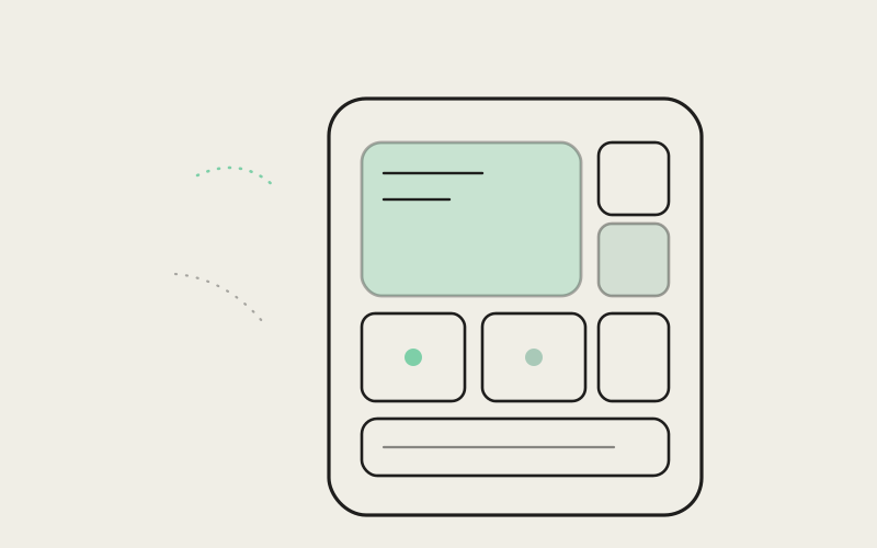
A bento grid takes its name from the Japanese bento box — a tray divided into compartments of different sizes, each holding something distinct, all visible in a single glance without lids or drawers to open. Applied to a home screen, it means moving away from a uniform stack of same-shaped cards and toward a grid where card size itself carries meaning: a larger card for something that deserves more attention, a smaller card for something that's useful to see but doesn't need much space, different cards butting directly against each other's edges rather than floating in identical rows.
The reason this suits a dashboard-style home screen specifically is that a dashboard's whole purpose is showing several different categories of information at once, and a bento grid lets each category claim a footprint that matches its actual importance instead of a footprint dictated by "well, every card has to be the same size for consistency." Recent activity, which changes constantly and usually deserves the first look, can occupy a bigger, more prominent block. A row of hosts, which is more reference material than urgent news, can compress into a tighter, denser strip. Update notices can take a shape distinct enough that they don't blend into anything else on the screen. The grid does the prioritization work visually, before the user reads a single label.
Painting the Before and After
The old screen, described plainly: a vertical column of similarly sized rounded rectangles, each roughly the same height, separated by even gaps, scrolling downward in a single predictable rhythm. Nothing on it competed for your eye because nothing was built to win that competition — your gaze moved down the column the same way it would move down any list, top to bottom, reading order rather than importance order.
The new screen reads differently the instant it loads. The largest block on the screen — the one your eye actually lands on first — is reserved for what's happening right now: recent activity, rendered in a card that's visibly bigger than anything around it, not because it needs more room for content but because size itself is doing the job of saying look here first. Below and beside it, smaller cards of varying proportions hold hosts and quieter status information, tucked into the grid at a scale that says useful, not urgent. Update notices get their own compact, visually distinct shape — small enough not to dominate the screen when there's nothing new, but present enough that when something has changed, it doesn't get lost in a wall of uniform boxes. Cards butt against each other's edges instead of floating with identical margins, which reads less like a list and more like a single composed surface, closer to a dashboard than a feed.
"I check the app first thing most mornings before I've had coffee, basically to answer one question: did anything break overnight. With the old layout I had to actually scroll and read a couple of cards to answer that. Now the activity card is just bigger, and it's the first thing I see — if nothing's there, I know in about a second and I'm done. It sounds small but it's the difference between checking the app being a five-second habit and a thirty-second one."
— Jamie Whitfield, solo indie iOS developer
The Real Tension: Density Versus Clarity on a Small Screen
None of this was free, and the team didn't pretend otherwise. A bento grid, taken too far, is just a different way of cramming too much onto a phone screen — swap uniform boxes for a tighter mosaic of differently sized ones, and you can just as easily end up with something that looks busy instead of organized. The whole premise of the redesign was showing more at a glance without sacrificing clarity, and those two goals actively pull against each other on a screen the size of a phone.
The resolution wasn't a single rule so much as constant restraint during the design process: every card that earned a larger footprint had to justify it against something more urgent losing space, and every attempt to add "just one more" compact card to the grid got weighed against whether it was actually making the screen easier to triage or just easier to fill. A bento grid gives you the visual language to express hierarchy through size and position, but it doesn't enforce good hierarchy on its own — it's entirely possible to build a bento grid where everything is still trying to be the biggest card, and that would have reproduced the exact flatness problem the redesign was meant to fix, just with more visual noise around it.
"The tension people don't expect with a phone dashboard is that adding structure can make a screen feel more crowded, not less, if you're not careful — more distinct shapes, more edges, more things visually competing. We had early internal versions of this grid that technically showed more information than the old layout and felt worse to look at, because everything on it was still trying to matter equally, just in more interesting shapes. The version that actually shipped is the one where we were willing to make some cards genuinely small and quiet, so the one or two that actually mattered could be big without the whole screen feeling loud."
— Theo Lindqvist, Founding Engineer, Influxx
Why We're Calling This a Second Pass, Not a Fix
It would be easy to describe this redesign as correcting a mistake, and there's some truth in that, but "mistake" isn't quite the right frame. The first home screen was a reasonable first attempt built with limited information about how people would actually use the app day to day — how often they'd check it, what they'd be looking for first, how many hosts and how much recent activity a typical account would accumulate. Real usage surfaced the flatness problem in a way that no amount of internal review caught beforehand, because the failure mode wasn't a bug anyone could point to — it was a screen that technically worked and quietly underperformed at the one job that mattered most.
That's also the honest limitation worth naming here: a bento grid is not a universal answer, and it isn't guaranteed to age well either. As the number of categories on the home screen grows — more integrations, more kinds of status to surface — the same crowding problem the team fought during this redesign will resurface, and there's no guarantee the current card sizes and proportions will still feel right once the underlying set of things worth showing has grown again. This version is better tuned to what the home screen needs to show today, not a permanent solution to the tension between density and clarity.
Frequently Asked Questions
What is a bento grid in mobile app design?
A bento grid is a layout made of clearly bounded cards of different sizes arranged in a single composed grid, named after the compartmentalized Japanese bento box. Unlike a uniform list of same-sized cards, card size itself communicates importance, letting a dashboard-style screen show several categories of information at once while still expressing which ones matter most.
Why did Influxx Mobile redesign its home screen a second time?
The original home screen used a uniform stack of similarly sized cards for hosts, recent activity, and update notices. It was legible on its own, but flat — nothing stood out, so the screen didn't help users triage what mattered first at a glance. The second pass moved to a bento-grid layout specifically to fix that lack of hierarchy.
Does a bento grid make a phone screen feel more cluttered?
It can, if it's not used carefully — that's the central trade-off. Packing a mosaic of differently sized cards onto a small screen without discipline about which cards deserve to be small just produces a busier version of the same crowding problem. The redesign relied on giving only the most time-sensitive information a larger footprint and keeping everything else deliberately compact.
What kinds of information does the Influxx Mobile home screen show?
The home screen surfaces several categories at once: hosts you connect to, recent activity across your sessions, and update notices. The bento-grid redesign gives each of these a card size proportional to how urgent or time-sensitive it typically is, rather than treating them all identically.
Is a bento-grid home screen harder to scan than a simple list?
It's meant to be easier, not harder, precisely because it isn't a list. A list requires reading in order to find what matters; a well-built bento grid uses size and position to draw the eye to the most important information first, which is the specific problem the original uniform layout failed to solve.
Will the home screen layout change again as more features get added?
Likely, yes. The current card sizes and proportions are tuned to what the home screen needs to show today. As more categories of information get added over time, the same tension between showing enough and staying legible will need to be revisited — this redesign solves the problem the team could see now, not permanently.
There's a version of this story where we describe the bento grid as the layout we should have shipped from the beginning, and it would make for a tidier narrative. It wouldn't be honest. The first home screen was a genuine, reasonable attempt, and it took real daily use to reveal that "legible" and "prioritized" aren't the same thing — that a screen can show everything correctly and still fail at the one job a home screen actually has. The second pass exists because we were willing to look at something we'd already shipped and admit it wasn't quite right yet. That's a less flattering story than getting it right the first time, and it's the truer one.