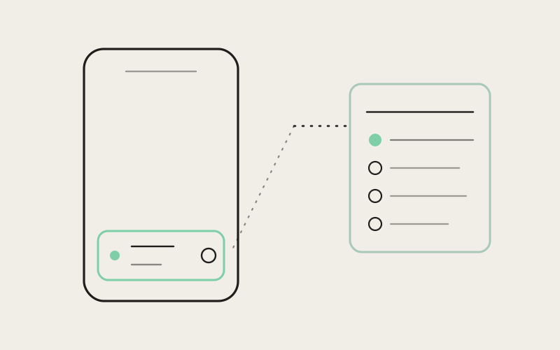
Influxx's desktop app has a whole rail of chrome dedicated to answering one question: what is my agent doing right now. Status, active branch, changed files, tool activity, a running plan — all of it visible at a glance, all of it with room to breathe. Influxx Mobile had to answer the exact same question inside a chat composer a few centimeters tall, held in one hand, glanced at for less than a second at a time. This is the story of how that compact strip came together — and the parts of the desktop experience we had to admit just don't fit on a phone.
Why Phone Status Is a Harder Problem Than the Desktop Version
It's tempting to treat mobile status design as a shrinking exercise — take the desktop rail, scale it down, ship it. That instinct doesn't survive contact with an actual phone. A desktop status rail can afford a label next to an icon, a hover tooltip that reveals detail on demand, a second row of text nobody has to commit to memory because it's simply sitting there, always visible, in peripheral vision while you work on something else. None of those affordances exist on a phone screen mid-composer.
Start with the obvious constraint: there is no hover state on a touchscreen. Every piece of information the desktop rail reveals progressively — glance, then hover, then read — has to either be visible immediately on mobile, or hidden behind a deliberate tap. There's no in-between state where information is "available but not intrusive." On mobile it's either on the screen right now, competing for space with everything else, or it isn't there until you go looking for it.
Then there's the thumb. Desktop status chrome is read with your eyes and occasionally clicked with a precise mouse cursor. Mobile status chrome is read with your eyes and operated with the pad of a thumb, usually the same thumb that's about to type a reply, while the phone is held in one hand and the other hand might be doing literally anything else — carrying a coffee, holding a subway pole, resting in a pocket. Every tap target has to be sized for that reality, not for a cursor with pixel precision.
And then there's the speed requirement, which is really the hardest part. A developer checking the desktop rail is usually already at their desk, already in a working posture, willing to spend a few seconds reading. A developer checking their phone is usually doing it in a stolen moment — between meetings, walking somewhere, half-listening to something else — and the status strip has to communicate its core fact in under a second or it has failed at its actual job. Under a second means no reading a sentence. It means shapes, color, and position doing work that words would normally do.
One Thumb, No Hover, One Glance
Those three constraints — no hover, one thumb, sub-second glanceability — don't stack neatly on top of each other. They compound. A design that solves for "no hover" by putting everything on screen at once usually fails "one thumb," because now there are six small targets crowded together and a thumb the size of a fingertip is going to miss. A design that solves for "one thumb" by making everything bigger usually fails "sub-second glanceability," because now the status information itself has been pushed off-screen to make room for touch targets. You can't solve these one at a time. The layout has to satisfy all three simultaneously, which is why this ended up taking real iteration rather than a straightforward port.
The version that shipped leans hard on color and position doing the reading for you. A single-word or single-icon status indicator sits in a fixed, consistent spot every time — same corner, same size, same color language — so your eye doesn't have to search for it session to session. The active project and branch sit next to it in a compact label that truncates gracefully rather than wrapping, because a status strip that reflows its own height depending on branch-name length is a status strip that's unreliable to glance at; its position would shift under you.
"On desktop you can be generous with space and let information just sit there, unread, most of the time, and that's fine — it's not costing you anything. On mobile every pixel of that strip is rent. If a piece of status information isn't worth its rent, it doesn't survive in the always-visible layer. It goes behind a tap, or it doesn't ship at all."
— Devon Okafor, Design Systems Lead, Influxx
Designing One Strip That Does Three Jobs
The composer strip isn't just a status readout. It also hosts a toggle that shows or hides the agent's raw tool activity, and a create-pull-request action for when a session is ready to hand off. Three genuinely different jobs — passive status display, an interaction toggle, and a committing action — sharing one horizontal strip a couple centimeters tall. Cram those together carelessly and you get exactly what it sounds like: three unrelated buttons that happen to share a row, each competing for attention, none of them reading as part of a coherent whole.
The fix wasn't clever iconography. It was hierarchy through weight and position, the same tool visual design has always used to make a group of controls feel like one object instead of three. Status lives in a fixed anchor point and never moves, because it's the thing you check without deciding to check it — closer to peripheral vision than to a deliberate read. The tools-visibility toggle sits as a lighter-weight, secondary control, because flipping it is an occasional decision, not a constant one, and a control you reach for occasionally shouldn't visually compete with one you glance at constantly. The pull-request action is the only one styled with real visual weight — a filled shape, not just a line icon — because it's the one truly committing action in the row, the one where a mistaken tap has a real consequence, and it needed to read as distinct from the passive information sitting next to it.
That ordering — passive, then occasional, then committing — turned out to matter more than any single visual treatment. Once the three controls were arranged by how often you'd actually reach for each one, rather than by how naturally they occurred to us as engineers, the strip stopped feeling like a junk drawer and started feeling like one object with three uses.
The Steps Pill: One Line That Knows There's More Underneath
The hardest single piece of this strip to get right was what we ended up calling the steps pill — a compact indicator that shows a running agent's progress through a multi-step plan without ever showing the whole plan by default. An agent working through a real task rarely does one thing; it reads a few things, makes a change, checks the result, adjusts, and moves on, often five, ten, sometimes twenty discrete steps deep before it's done. All of that has to compress down into something that fits in a strip a few characters wide.
The pill shows the barest structural fact — roughly where the agent is in its own plan, and that there is a plan at all — and nothing more, until you tap it. Tapping expands it into a full checklist: every step the agent identified, which ones are done, which one is active right now, which ones haven't started. Collapsed, it's a glance. Expanded, it's a map.
Why Structure Beats a Scrollback Log on a Small Screen
On desktop, if you lose track of what a long agent run has been doing, the fallback is almost always the same: scroll back up through the terminal log and read your way back to context. That's a reasonable fallback on a wide screen with a mouse wheel and a lot of visible lines at once. It's a genuinely bad fallback on a phone, where the same log is a narrow, slowly-scrolling column that takes real time and real thumb effort to page back through, and where you lose your place in the actual conversation the moment you start scrolling away from it.
Showing some structure to a long run — even just "step 4 of 9, currently editing" — means you never have to fall back to scrolling a giant log to reorient yourself. You get the same reorientation a desktop user gets by glancing sideways at a rail, except it's delivered by a tap instead of a glance, because there isn't room for the sideways rail in the first place. The steps pill isn't trying to replace the terminal log. It's trying to make sure you almost never need to go read it just to answer "where are we."
"I kick off a task before I leave for the day and check on it from my phone on the train. Before, checking in meant scrolling through a wall of output trying to figure out if it was almost done or barely started. Now I glance at the pill, see it's on step 6 of 8, and I know exactly how much patience I need without reading a single line of the actual log."
— Marcus Yeboah, senior iOS engineer at a fintech startup, Influxx user
What Didn't Fit: The Honest Cuts
Not everything on the desktop status rail made it to the phone, and pretending otherwise would be dishonest. Some information that sits comfortably on a wide rail — secondary metadata, less-common status states, a longer list of every file touched rather than a summarized count — genuinely doesn't fit in a strip built for a sub-second glance, no matter how cleverly you try to abbreviate it. We tried, at various points, to shrink everything proportionally: smaller type, tighter spacing, abbreviated labels for every field the desktop shows. It didn't work. Past a certain point, shrinking stops being a size reduction and starts being an information loss disguised as a size reduction — text too small to read at arm's length isn't information anymore, it's decoration.
So instead of shrinking everything a little, we cut some things entirely and kept the rest at a size a thumb and an eye could actually use. The changed-files display on mobile shows a compact count and lets you tap through to the real list, rather than trying to list filenames in the strip itself the way desktop can afford to. Less-common status states collapse into a general "needs attention" signal on the strip, with the specific reason available a tap away, rather than each getting its own always-visible micro-icon fighting for the same few pixels. It's a real trade-off, not a free lunch — a developer who's memorized every desktop status icon will occasionally have to tap once on mobile where they wouldn't have had to on desktop. We made that trade deliberately, on the belief that a phone screen that's honest about what it can show clearly is more useful than one that tries to show everything and ends up showing none of it well.
"The instinct on any port is to ask 'how do we fit all of it.' The better question is 'what actually needs to be true at a glance, on this device, for this person, in this moment.' Those are different lists, and the mobile status strip only works because we were willing to let them be different."
— Marcus Idehen, Director of Product Engineering, ETAPX
Designing for the Moment You Actually Check Your Phone
None of this was built by imagining an idealized user sitting still, giving the phone their full attention. It was built around the real moment this strip gets used: a quick check between other things, one thumb, a couple of seconds at most. That's a genuinely different design brief than the desktop status rail was written against, even though the underlying question — what is my agent doing right now — is identical on both platforms. The desktop rail can afford to be complete. The mobile strip has to be correct about what matters most, because it doesn't get to be complete.
That distinction shaped almost every decision in this piece of the app, from the fixed position of the status indicator to the decision to compress a whole running plan into one pill you tap open rather than a scroll of text you read straight through. A phone screen doesn't reward completeness. It rewards a design that already knows, ahead of you, what you're going to need in the next second — and gets out of the way of everything else until you ask for it.
Frequently Asked Questions
Does the Influxx Mobile status strip show the same information as the desktop status rail?
Not all of it, and that's deliberate. The strip shows the information that matters most for a sub-second glance — live status, active project and branch, and a compact steps indicator — and puts less-common or secondary information a tap away rather than trying to fit everything the desktop rail shows into the same small space.
What does the "steps" pill on the mobile composer actually show?
A compact, single-line summary of where a running agent is in its own multi-step plan. Tapping it expands into a full checklist showing every step, which ones are complete, which one is currently active, and which haven't started yet.
Why can't I see the full changed-files list directly in the status strip?
The strip shows a compact count so it stays glanceable at a fixed size; tapping through gets you the full list. Listing every filename directly in the strip the way the desktop rail can afford to would either make the strip too tall to glance at or force the text too small to read comfortably.
Can I create a pull request directly from the mobile status strip?
Yes. The create-pull-request action lives in the same strip as the status display and the tools-visibility toggle, styled with more visual weight than the other two controls since it's the one action in the row with a real, committing consequence.
Why does the mobile app hide some status detail that's always visible on desktop?
Because a phone screen genuinely can't show everything a wide desktop rail can while staying readable and tappable. Rather than shrink every field proportionally until it becomes illegible, we chose to show fewer things clearly and put the rest behind a deliberate tap.
Does checking agent status on mobile require scrolling through the session log?
Not for the common case. The point of the compact strip and the steps pill is to answer "what's happening and how far along is it" without needing to scroll back through the underlying session log to reconstruct that context yourself.
Is the mobile status strip likely to change as the app evolves?
Very likely, in the same way the desktop status rail has changed over time. The current design reflects what we've learned fits a sub-second glance today; as agent runs and the plans they generate change shape, the strip's layout will keep getting revisited rather than treated as finished.
The desktop status rail earned its space over years of iteration, on a screen with plenty of room to be generous. The phone strip had to earn the same trust in a fraction of the space, with none of the generosity available. Getting there wasn't about finding a clever way to fit more in — it was about being honest, row by row, about what a glance actually needs, and having the discipline to leave the rest one tap away instead of pretending it could all fit at once.