
For months, the two pieces of UI a developer touches most in Influxx — the strip that shows what the agent is doing and the box where you actually type to it — sat next to each other looking like two different products. Different fill colors, a hard divider line, corners that didn't line up at the seam. We spent a redesign cycle making them read as one object instead of two, and the fact that it took real iteration to get a boundary to simply disappear taught us more about interface trust than any feature we shipped that quarter.
The Seam Nobody Asked For
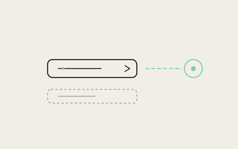
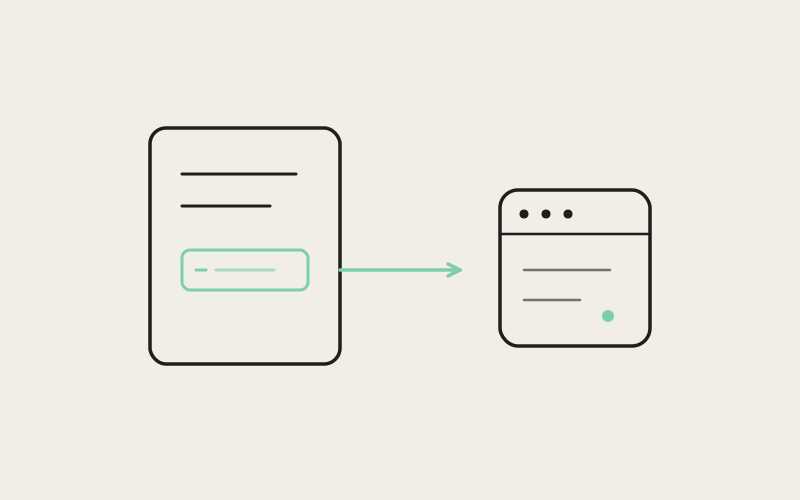
Every session in Influxx has a context strip sitting above the composer — a thin band showing which tools are available, what project you're in, and a live status of what the agent is currently doing. Below it, the composer itself: the text field you type into, plus the row of controls for attachments, model selection, and send. Functionally, they were always meant to be read together, one continuous unit that frames a single conversation. Visually, for a long time, they weren't.
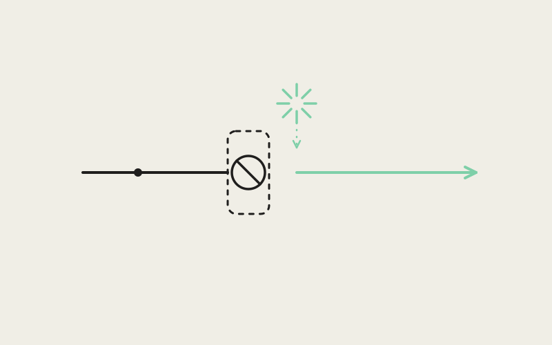
The context strip used a slightly different background tone than the composer beneath it. Between them ran a solid one-pixel divider, the kind of line a UI kit gives you for free and nobody thinks twice about. And where the two pieces met, their corner radii didn't agree — the strip's bottom corners were sharper than the composer's top corners, so the seam itself had a visible kink in it, a tiny mismatch you wouldn't consciously name but would absolutely feel.
None of this was a bug. Each piece had been built correctly in isolation, by people solving the problem in front of them at the time. The context strip needed a status readout; the composer needed an input field; both got built, both worked, and neither was designed with the other's edges in mind. That's a completely ordinary way for software to accumulate small seams — and a completely ordinary way for a fine, functional interface to end up feeling like two things bolted together instead of one thing that was made.
Why a Visible Seam Quietly Erodes Trust
It's tempting to dismiss a background-color mismatch and a stray divider line as cosmetic. In an interface you glance at for thirty seconds, it probably is. Influxx's composer is not that kind of interface. During a long agent session, it's the single element on screen with the most sustained visual attention — the place your eyes return to between reading the agent's output, watching status updates, and typing your next instruction. Anything in that visual field that reads as "two separate systems" adds a small tax to every one of those returns.
The mechanism is ordinary perceptual psychology, not mysticism. A visually distinct region signals a boundary — a place where behavior might change, where a click might do something different than it does an inch away, where state might not be shared. When two regions that are actually part of the same interaction are drawn as if they're separate systems, the reader's mind has to spend a fraction of a second reconciling that mismatch, over and over, every time attention crosses the seam. It's not a conscious thought. It's closer to friction — the visual equivalent of a door that looks like it should push but actually pulls. You adjust, but the adjustment costs something, and in software you interact with for hours at a stretch, those costs compound.
There's a related principle we lean on across the product: fewer visually distinct regions read as a calmer, more considered interface, even when the underlying functional complexity hasn't changed at all. A crowded screen doesn't necessarily need fewer features. It usually needs fewer visual boundaries between the features it already has. Grouping related controls under one shared surface — one fill, one edge, one shadow — tells the eye "this is one thing" faster than any amount of spacing or labeling could.
"People assume design polish is about making things prettier. Most of the work we did on the composer was closer to structural correction — we weren't adding decoration, we were removing false signals. A divider line where there shouldn't be a boundary is a false signal. It tells your eye something is true that isn't. Fixing that isn't decoration, it's honesty."
— Devon Okafor, Design Systems Lead, Influxx
What "Unified" Actually Means, Pixel by Pixel
Saying "make it feel like one surface" is easy. Deciding exactly what that means in concrete terms took several passes. The first instinct — just remove the divider line — turned out to be necessary but nowhere near sufficient. Without the line, the color mismatch between the strip and the composer became more obvious, not less, because there was no longer a visual explanation for why the two regions looked different. A boundary you can't see but can still perceive is worse than an honest, visible one.
So the fill colors had to match exactly — not "close enough," but the identical token, so there was zero perceptible seam even under close inspection or on a high-density display. That alone solved most of the color problem but exposed the corner-radius mismatch more clearly, since now the only remaining cue that these were two separate pieces was a subtle kink in the outline where the strip's corners met the composer's. We looked at how a handful of reference interfaces we admired handled the same problem — panels stacked directly on top of one another with no visible gap — and noticed a consistent pattern: the upper piece's bottom edge is drawn to tuck slightly behind the lower piece's top edge, rather than the two edges meeting flush. It's a small overlap, often just a few pixels, but it changes how the boundary reads entirely. Two flush edges meeting at a corner look like a seam no matter how well you match the colors. One edge tucked behind another looks like a fold in a single physical object.
That became the actual fix: shared fill color, the divider hidden entirely, and the context strip's bottom edge redrawn to sit fractionally behind the composer's top edge rather than butting up against it. The composer now reads as the front-facing surface, with the status strip folding in behind it, the way a single card with two zones would look if you'd designed it as one piece from the start instead of assembling it from two.
Getting It Wrong Before Getting It Right
The version that shipped wasn't the first version that looked correct in isolation. An early pass over-corrected — removing so much visual separation between the strip and the composer that the status information stopped reading as a distinct zone at all, and testers started missing status changes because nothing drew the eye there anymore. The lesson wasn't "remove all boundaries," it was "remove the false boundary while keeping the real one legible" — the strip and composer are one physical object, but they still do different jobs, and the status strip still needed enough visual weight — a slightly different text treatment, tighter vertical rhythm — to read as its own functional zone within that one object, the same way a single photograph can still have a clear foreground and background.
Getting that balance right took several rounds of sitting the new composer next to the old one, side by side, and asking a simple question each time: does this look like one thing wearing two hats, or two things pretending to be one? The final version had to pass that test not just in a static screenshot but while live — status text updating, tool badges appearing and disappearing, the composer's border reacting to focus — because a seam that's invisible when static can reappear the moment either region starts animating independently of the other.
The Payoff During a Long Session
The place this mattered most wasn't the first five minutes of using Influxx — it was hour three of a multi-hour agent session, the kind where you're bouncing between reading long tool output, glancing at status, and typing follow-up instructions dozens of times without ever really looking away from that one region of the screen. In that mode, the composer isn't just an input field, it's closer to a cockpit instrument you're reading peripherally while your attention is mostly on the agent's output above it. An instrument with a visible seam running through it is one your eye has to keep re-parsing. One drawn as a single continuous surface just recedes — you stop noticing it as an assembled thing and start using it as a single tool.
That's the actual argument for spending real design cycles on something this small. Nobody opens Influxx because the composer has no divider line. But over a multi-hour session with hundreds of round-trips between typing and reading, the cumulative weight of a dozen tiny frictions — a seam here, a mismatched corner there — adds up to a workspace that feels tense in a way that's hard to name. Removing them doesn't add a feature. It removes a very quiet, very cumulative source of fatigue.
"I couldn't have told you what was wrong with the old composer if you'd asked me directly — I just knew that after a few hours of a long refactor session, my shoulders would be up around my ears. After the update it's genuinely a calmer screen to stare at for a full workday. It's not a dramatic difference in any single moment. It's a dramatic difference by 6pm."
— Priya Raghavan, senior backend engineer at a fintech startup, Influxx user
What This Wasn't Trying to Solve
It's worth being precise about the scope of this change, because it would be easy to oversell it. Unifying the composer and the context strip didn't change what either piece does, didn't add functionality, and didn't make the underlying agent faster or smarter. It's purely a perceptual correction — removing a false signal about where one interactive region ends and another begins. If your actual frustration with an agent tool is response latency, tool reliability, or the quality of what the agent produces, a tighter seam between two panels isn't going to move that needle, and we'd be doing readers a disservice to imply otherwise.
There's also a genuine trade-off we accepted rather than solved. Collapsing the visual boundary between the status strip and the composer means the two zones now compete more directly for the same limited vertical space when the window gets narrow — on a smaller viewport, keeping the status strip legible as its own zone while still reading as part of one unified surface required tighter text truncation and, in the tightest cases, dropping some status detail entirely rather than letting the layout fight for room. We chose fewer status details over reintroducing a visible seam to buy back space, on the belief that the calm-surface effect matters more than the completeness of the status readout in the narrowest window sizes. That's a real trade-off, not a solved problem, and someone running Influxx in a genuinely cramped window will notice the difference.
"We think about interface trust the same way we think about trust in the agent's output itself — both are earned in small, repeated moments rather than one big reveal. A composer that visually contradicts itself, even in a detail as minor as a mismatched corner, is a tiny withdrawal from that trust account every time someone notices it, consciously or not. Fixing it was never going to be the headline feature of a release. It was table stakes for everything else we build on top of that surface."
— Marcus Idehen, Director of Product Engineering, ETAPX
How This Fits the Rest of the Design System
The composer wasn't fixed in a vacuum. Influxx's design system leans hard on a small set of rules about when two adjacent regions should share a surface versus when they should be visually separated, and the composer redesign was as much about applying that rule consistently as it was about this one component. The underlying question we ask before drawing any boundary in the product now is simple: does this line represent a real functional distinction the user needs to track, or is it an artifact of how the feature happened to get built? A divider between two panes showing genuinely independent content — two different agent sessions, say — represents a real distinction and should stay visible. A divider between a status readout and the input box it's describing does not, because they're never meaningfully separate to the person using them.
That framing turned into a quiet audit across other parts of the product, not just the composer, looking for seams that had accumulated the same way — correctly built in isolation, never reconciled against their neighbor. Most of what we found was smaller than the composer case. None of it was as visible, because nothing else in the product gets stared at for as many consecutive hours as that one region.
Frequently Asked Questions
Why did the composer and status strip in Influxx desktop look like separate panels before?
They were built at different times by people solving the problem directly in front of them — a status readout and a text input — without a shared pass to reconcile their fill color, corner radius, and the divider between them. Each piece was correct on its own; together they read as two bolted-together panels rather than one surface.
Does a unified composer design actually change how it feels to use, or is it purely cosmetic?
It's a perceptual change, not a functional one — nothing about what the composer does or how the agent responds changed. But in an interface you look at continuously for hours, a false boundary between two zones adds a small, repeated cognitive cost every time your attention crosses it. Removing that boundary removes the cost, even though no new capability was added.
What's the actual design trick for making two stacked UI panels look like one object instead of two?
Matching fill color alone isn't enough — it just makes the remaining seam harder to explain. The combination that worked was: identical fill color across both regions, no visible divider line, and the upper region's bottom edge drawn to tuck slightly behind the lower region's top edge rather than meeting it flush, the way a single folded object would look rather than two separate pieces placed next to each other.
Is there a downside to removing visual separation between different functional zones in one interface?
Yes — if you remove too much, the zones stop reading as functionally distinct even though they still do different jobs, and people miss information because nothing draws the eye there anymore. The goal isn't zero visual structure, it's removing false boundaries while keeping real functional distinctions legible through other means, like text weight or spacing.
Does this composer redesign work the same way on a narrow or resized window?
Mostly, but narrow windows are a genuine trade-off point. To keep the unified-surface look on a smaller viewport, some status detail in the strip has to truncate or drop rather than fighting the composer for vertical space, which we chose over reintroducing a visible seam to reclaim room.
How much design effort does something this small actually take to ship?
More than it looks like from the outside. This particular change went through several visibly wrong intermediate versions — over-correcting into no visual structure at all, mismatched corner radii even after fill colors matched — before landing on the final combination, because the target wasn't a single static screenshot but a UI that had to hold together while live and animating.
Does Influxx apply this same "fewer visible seams" principle anywhere else in the product?
Yes. The composer redesign prompted a broader look at other places in the product where visually distinct regions had accumulated without a real functional reason to stay separate. The underlying rule is simple: a boundary should exist only where it represents a genuine distinction the user needs to track, not as a byproduct of how a feature happened to get built.
A seam is a small thing to spend a redesign cycle on, and we're aware of how that sounds from the outside. But the composer is the one piece of Influxx nearly everyone stares at for the longest stretch of any single session, and the things you stare at longest are exactly the things where a small, cumulative wrongness matters most. Making it read as one object instead of two didn't make the agent smarter. It made the tool quieter, and for something you sit with for hours, quiet turns out to be most of the job.