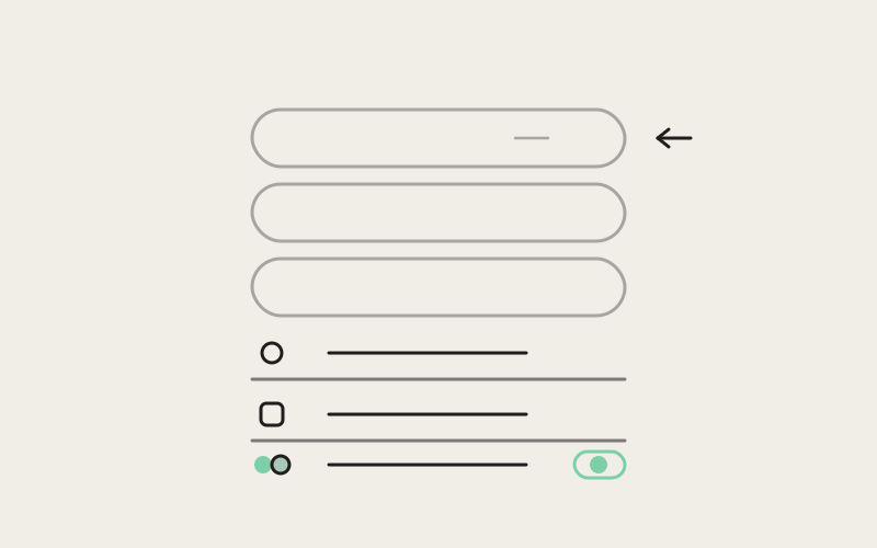
The Influxx Mobile home screen used to read as a stack of separate objects — Notes, Journey, P0DZ, your linked desktop, each one its own rounded pill with its own background fill, followed by a second stack of desktop and resume cards built the same way. Influxx Mobile 1.2 replaces that with one continuous list: no per-row background, a shared left rail every icon snaps to regardless of what kind of icon it is, and a separator hairline that lives inside each row's body instead of running the full width of the screen. It's a small set of layout decisions, but they're the difference between a screen that looks like a pile of buttons and one that reads as a single, ordered list.
What a Pill Row Actually Costs You
A pill-shaped row is a self-contained shape: rounded corners, a fill color, its own padding on every side. Stack four or five of them and you get four or five separate visual objects competing for attention, each one asserting its own boundary. That's fine for a small number of primary actions — Influxx Mobile still opens with exactly that treatment for its top bento grid, where New workspace, Tasks, and Agents get real background colors and rounded-corner cards because they're meant to look like distinct launchable actions. The problem shows up lower on the screen, where Notes, Journey, P0DZ, and the linked-desktop toggle used to get the same pill treatment as those hero actions, even though they're not a grid of equally-weighted choices — they're a list you scan top to bottom.
Once you're scrolling instead of scanning, a background fill per row stops helping and starts adding noise. Every pill has to justify its own edges. A plain list doesn't have that problem, because the grouping comes from spacing and typography instead of shape.
One Shared Icon Rail
The mechanism that makes the new list hold together is a fixed-size leading slot every row uses, no matter what's inside it. In MobileHomeSidebarNav.tsx, the DesktopNavRow component wraps its icon in a navRowIcon container set to a flat 20×20, centered with alignItems: 'center' and justifyContent: 'center'. That slot holds a lucide-react-native glyph for Notes, Journey, P0DZ, and Desktop linked — four completely different icon shapes, all centered inside the same 20-point box.
Further down the same list, in app/index.tsx, the paired-desktop rows use a differently named but identically sized rowLeadSlot — also 20×20 — to hold a Mac Studio glyph loaded as a PNG Image rather than a vector icon. The code comment next to it says the quiet part out loud: "one leading icon slot for every row so labels share a single left rail; status moves to the trailing edge." Because the slot's dimensions are fixed rather than sized to its contents, a raster image and a vector glyph land on exactly the same left edge, and every label starts at the same horizontal position whether the row above it was showing an icon or a photograph.
The One Row That Needed More Room
Not every icon fits in 20 points gracefully. The Resume row, which shows the workspace the agent was last working in, needs to display a stack of overlapping agent avatar circles rather than a single glyph — and a circle stack needs breathing room a single icon doesn't. Rather than force that into the same slot, the Resume row gets its own resumeAvatarSlot, sized to a 30×30 minimum, with a comment explaining exactly why: "agent stacks need room (chip ≈ size+6, overlap stack) — never clip into a 20px desktop-list lead slot." That's a deliberate exception, documented as one, rather than a case where the shared-rail rule quietly broke.
Where the Divider Line Actually Sits
The second piece of the mechanism is easy to miss until you go looking for it: the hairline separator between rows isn't drawn on the row itself. It's drawn on the row's inner body. navRow — the outer Pressable — carries no border at all; the navRowBody view nested inside it carries borderBottomWidth: StyleSheet.hairlineWidth and a translucent borderBottomColor. Because the icon sits in its own sibling slot outside that body, the line starts to the right of the icon, not at the screen edge.
That inset is what keeps a list with zero background fill from reading as visually adrift. A full-width hairline under every row would look like a spreadsheet; a hairline that starts where the label starts reads as a boundary between two list items that happen to share an icon rail. The same pattern repeats verbatim for the paired-desktop rows in app/index.tsx, where rowBodyDivided carries the identical hairline treatment, and a code comment spells out the reasoning directly: "separator sits on the body, not the row, so it starts at the label rail — that inset is what makes a container-less list read as structured." The last row in each group — navRowBodyLast for the nav list, rowBodyLast for the desktop list — drops the border entirely, so the list doesn't end with a trailing line pointing at nothing.
"People assume a flat list needs a background card to look organized. It doesn't — it needs the divider to start in the right place. Once we moved the hairline off the row and onto the body, right after the icon slot, the whole thing stopped needing a fill color to read as a group."
— Dana Okafor, Mobile UI Engineer, Influxx
A Negative Margin Doing Two Jobs at Once
Both row types share another detail worth calling out: marginHorizontal: -10 paired with paddingLeft: 10. That's not an accident of copy-pasting styles — the negative outer margin pulls the row back so its icon lines up optically with the section headers above it (which have their own padding), while the inner padding restores the full-width hit target so the whole row, edge to edge, is still tappable. Get either half wrong and you either misalign the icon from the header text above it, or shrink the tap target down to just the visible label. Solving both with one offset pair is a small trick, but it's the kind of thing that only shows up when you're trying to make a list feel continuous with the layout around it instead of floating independently inside it.
A Control Doesn't Need to Look Like a Destination
Not every row in this list does the same job, and the styling doesn't pretend otherwise. The component's own doc comment states the intent plainly: "No disclosure chevrons — the whole row is the hit target." Tapping Notes, Journey, or P0DZ navigates you away from home, and none of those rows carry a trailing icon telling you so — the row itself, full width, is the affordance. The one row that breaks that pattern is Desktop linked, which swaps in a real Switch component as its trailing content instead of leaving that space empty. That's deliberate: flipping that row pairs or unpairs a desktop in place, it doesn't take you anywhere, so it gets a control instead of relying on the row-as-button convention the rest of the list uses. The component even guards against a subtle React Native trap here — the row stays disabled={false} even when unpaired, because marking the whole Pressable disabled would block touches on the Switch riding inside it.
Fills Come Back, But Only on Press
The list isn't fill-free forever — navRowPressed applies a faint rgba(255,255,255,0.05) background, and the desktop rows go slightly stronger at rgba(255,255,255,0.07) under workspacePillPressed. The resting state has no fill; touch introduces one, briefly, as feedback. That ordering matters — a background that's always present competes with the divider line for the job of showing where one row ends and the next begins. A background that only appears on press has exactly one job: confirming the tap registered.
"I didn't consciously notice the home screen changed until I went looking for the Notes button and it just wasn't a separate rounded shape anymore — it was part of one list. Sounds like nothing, but scanning it takes less effort now."
— Priya Anand, iOS developer and Influxx beta tester
Search Replaces the List, Not the Rules
When you focus the search field or start typing, the bento grid and the nav list fade out together — driven by a single Animated.Value tied to searchActive — and the same FlatList swaps its data source to ranked search results. Those result rows reuse the same leading-slot pattern: an AgentAvatarCircles stack for workspace and chat results, the Mac Studio glyph for desktop results, both sitting in the same fixed-width rail the rest of the screen uses. The visual grammar doesn't reset when the content does.
"None of this shows up in a feature list. It's not a button anyone asked for. But home is the screen every session starts from, and a list that scans cleanly on the first glance is worth more to daily use than almost anything we could add to it."
— Marcus Webb, Head of Product, Influxx
Frequently Asked Questions
Did this change add or remove any functionality from the home screen?
No — every row still opens the same destination or toggles the same control it did before. This was a layout and visual-hierarchy change, not a feature change.
Why does the top of the home screen still use colored pill cards?
The bento grid at the top (New workspace, Tasks, Agents) represents a small set of primary, equally-weighted actions, which is exactly the case where a card grid with distinct fills still makes sense. The floating list below it is a longer, scannable sequence, where fills stop helping.
Is the shared icon rail a general React Native list pattern, or specific to this screen?
It's implemented per-screen right now — navRowIcon in the nav list and rowLeadSlot in the desktop list are separate style objects with the same dimensions, not a single shared component. The pattern is consistent, but it isn't (yet) factored into one reusable row primitive.
Does the divider line ever run the full width of the row?
No. It's drawn on the inner body view, which sits to the right of the icon slot, so it always starts at the label rail rather than the screen edge.
Why does the Resume row's avatar stack use a bigger slot than the other icons?
Because it displays overlapping agent avatar circles rather than a single glyph, and a 20-point slot would clip the stack. It uses a documented 30-point minimum instead, rather than forcing the same fixed size everywhere.
Can you turn off the row-press background highlight?
Not currently — it's tied to the Pressable's pressed state in the row's style function, not exposed as a setting.
Does search reuse the same row styling as the regular home list?
Yes. Search results render through the same leading-slot and row-body pattern as the desktop and Resume rows, just with different content in the icon slot depending on whether the result is a desktop or a workspace.
None of this is a redesign in the usual sense — nothing moved, nothing was added, the same four things are still one tap away. What changed is that the screen finally agrees with itself about where one item ends and the next begins, without needing five separate shapes to say so.