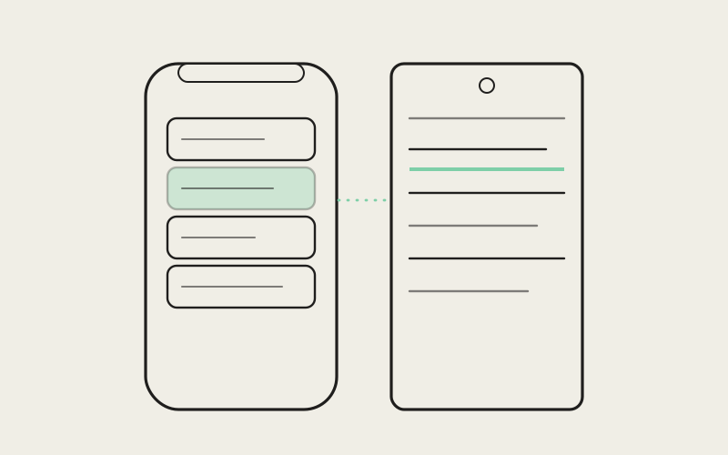
A settings screen looks like the least interesting part of any app to design, right up until you actually have to build one that covers account, notifications, permissions, appearance, and everything else that's accumulated feature by feature — and looks native on both iOS and Android without turning into either an unreadable wall of rows or two entirely separate apps pretending to be one. Influxx Mobile's settings area went through a restyle to match a refreshed design system, and the interesting part wasn't the visual polish. It was figuring out how to apply one consistent design language across dozens of screens while still letting iOS feel like an iOS app and Android feel like an Android app.
Why Settings Screens Are Harder Than They Look
Settings screens have a structural problem most other screens in an app don't: they grow by accretion. A new feature ships, it needs a toggle or a preference, and the natural place to put it is settings — not because settings was designed to hold it, but because settings is the drawer every app has for things that don't belong anywhere else. Over enough releases, that drawer fills up with account controls, notification preferences, permission requests, appearance options, an about section, and a long tail of smaller preferences that each made sense individually and, together, add up to a screen (or more accurately, a tree of screens) that's easy to get lost in.
The naive fix — group things into sections and hope the section headers do the work — only gets you so far. Grouping tells you where to look for a setting you already know exists. It does very little for the more common situation, which is opening settings without a specific destination in mind and needing the screen to be scannable enough that your eye finds the right row without reading every label on the way there. That's a design problem as much as an information-architecture one: rows need consistent visual weight, consistent spacing, and a predictable rhythm, or the screen reads as a pile of options rather than an organized surface.
The Discipline of One Design System, Two Platforms
The harder constraint sits underneath all of that: iOS and Android users have real, well-established expectations about how a settings screen should look and behave, and those expectations genuinely differ. iOS users expect inset grouped list rows, a particular navigation rhythm when drilling into a sub-screen, safe-area insets that respect the notch and home indicator without being asked. Android users expect a different visual density, a different navigation pattern, different conventions for how a back action behaves. An app that ignores those differences and renders one identical layout on both platforms doesn't read as consistent — it reads as foreign on whichever platform it wasn't designed for first, which is its own kind of inconsistency, just at a higher level.
So the restyle wasn't "make settings look the same everywhere." It was building a shared design system — consistent typography, consistent spacing rules, a consistent visual identity for icons and section headers, a consistent way rows communicate state — and then letting each platform express that system through its own native idioms. The typography and color language stays constant. The list row style, the navigation transitions, and the safe-area handling stay platform-appropriate. Getting that balance wrong in either direction produces a worse app: too much shared styling and you get an app that feels like neither platform's own; too much platform divergence and the shared design system stops meaning anything.
"The tempting shortcut is to build one settings screen and ship it on both platforms, because it's less work and it guarantees pixel-for-pixel consistency. We tried versions of that early on and they always felt slightly wrong on one platform or the other — usually Android, because a lot of shared-component thinking defaults toward iOS conventions without meaning to. What actually worked was defining the design system at the level of spacing, type, and color, then giving each platform its own native row and navigation treatment on top of that shared foundation. Consistent doesn't have to mean identical, and on mobile, identical often isn't actually consistent — it's just iOS wearing an Android costume, or the other way around."
— Yuki Tanabe, Mobile Infrastructure Engineer, Influxx
Respecting Platform Conventions Without Duplicating the Work
Respecting each platform's conventions doesn't mean building two unrelated settings experiences and maintaining them separately — that path leads to the two screens drifting apart every time one platform gets a feature update and the other lags behind. The approach instead was to treat platform differences as a defined, bounded set of variables layered on top of one shared structure: the same information hierarchy, the same grouping logic, the same set of screens and sub-screens, expressed through native list styling, native safe-area handling, and native navigation transitions on each platform respectively.
Safe-area insets are a good example of where this discipline actually earns its keep. iOS devices have a notch or a dynamic island at the top and a home indicator at the bottom, both of which claim real screen space that content shouldn't sit under. Android devices have their own version of this problem, with different system bars and gesture-navigation zones depending on the device and OS version. A settings screen that gets this wrong on either platform produces a visible, embarrassing bug — text clipped behind a status bar, a row partially hidden under a home indicator — and it's exactly the kind of detail that's invisible when it's handled correctly and glaring when it isn't. Handling it correctly per platform, consistently, across every sub-screen rather than just the top-level list, was one of the more tedious parts of the restyle and one of the easiest to get wrong.
Navigation Patterns That Match What Users Already Know
Navigation is the other place where forcing one platform's conventions onto the other shows up immediately. iOS users expect drilling into a sub-screen to slide in from the right with a back button in a specific, predictable place. Android users expect their own transition and back-gesture conventions, shaped by years of using other Android apps that all behave the same way. Settings screens are drilled into constantly — account settings, notification preferences, individual permission screens — so a navigation pattern that feels slightly off compounds every single time a user goes one level deeper, in a way that a single odd transition on a rarely visited screen never would.
Making Every Sub-Screen Feel Like Part of One Surface
The top-level settings list was never the hard part. The real test of whether a design system restyle actually worked is what happens three or four screens deep — the individual permission screen, the notification-preferences sub-screen, the about page nobody visits until they need to. Those are exactly the screens that tend to get neglected as an app grows, because each one shipped at a different time, often built by whoever was working on the feature that needed it, with whatever styling conventions were current at that moment. The result, before the restyle, was a settings area that was internally inconsistent in small but noticeable ways: slightly different row heights between one sub-screen and another, spacing that didn't quite match, icon styles from three different eras of the app sitting one tap apart from each other.
Applying the refreshed design system consistently across every one of those sub-screens — not just the entry list — is what turns settings from a pile of screens bolted on over time into something that reads as one coherent surface. The test isn't whether the top-level list looks polished; it's whether a user can drill four levels deep into a permission screen they've never opened before and have it feel unmistakably like part of the same app they started in, built with the same visual rules, rather than like they've wandered into an older, forgotten corner of it.
"I manage the mobile side of our on-call tooling for a distributed team, so I'm in and out of notification settings and permission screens more than the average user probably is. Before the restyle I could genuinely tell which settings screens were older just by how they were laid out — slightly different spacing, icons that didn't quite match. It sounds minor, but it made me trust the app a little less every time I hit one of those older screens, like I'd found a part of the house nobody had gotten around to renovating. Now every screen I open, no matter how deep, looks like it belongs to the same app. I didn't expect that consistency to matter to how much I trusted the settings, but it clearly did."
— Naomi Osei, engineering manager running a 12-person distributed team
The Trade-off: Consistency Work Doesn't Show Up as a Feature
It's worth naming plainly what this kind of restyle costs and doesn't buy. Nobody opens Influxx Mobile because the notification-permissions sub-screen has consistent spacing with the account screen. This work doesn't show up on a feature list, doesn't get its own release-notes headline, and is the kind of improvement most users will only ever notice by its absence — the mild, hard-to-articulate distrust of an app whose settings feel bolted together, versus the mild, equally hard-to-articulate confidence in one that doesn't. That's a genuinely difficult thing to prioritize against features that are easier to point at and say "users asked for this."
The honest limitation is that a settings area is never actually finished in this sense. Every new feature that needs a preference or a toggle is a new opportunity to either extend the design system correctly or to ship something slightly off because the deadline was closer than the review cycle. The restyle brought every existing screen into alignment, but keeping new screens aligned as the app keeps growing is an ongoing discipline, not a one-time fix — the same accretion pressure that made the old settings area inconsistent in the first place doesn't go away just because the current state is clean.
"Design system work on something like settings is a strange kind of investment, because the return is almost entirely defensive — you're not adding a capability, you're preventing an app from slowly feeling less trustworthy over time as it grows. It's easy to deprioritize in favor of anything with a more visible payoff. We made the call that a settings area is one of the few places in the app almost every user eventually visits, often when they're trying to fix or understand something, which is exactly the wrong moment to also be quietly telling them, through inconsistent spacing and mismatched icons, that this part of the app hasn't been looked after."
— Devon Okafor, Design Systems Lead, Influxx
What This Looks Like Going Forward
The practical outcome of the restyle is less a single visual change and more a constraint that now applies to every future settings screen: new preferences and new sub-screens inherit the shared design system by default, expressed through each platform's native row and navigation conventions, rather than each one reinventing its own look. That doesn't guarantee perfect consistency forever, but it moves the default from "consistent if someone remembers to check" to "consistent unless someone deliberately deviates," which is a meaningfully different starting point for an area of the app that grows constantly and gets revisited by almost every user sooner or later.
Frequently Asked Questions
Does Influxx Mobile's settings screen look the same on iOS and Android?
Not identically, and that's intentional. The two platforms share one underlying design system — the same typography, spacing, and information hierarchy — but each expresses it through native conventions: iOS-style grouped list rows and navigation on iOS, Android's own row and navigation conventions on Android.
Why doesn't a mobile app just use one identical settings design on every platform?
Because users on each platform bring strong, well-established expectations for how a settings screen should look and behave, shaped by years of using other apps on that platform. A single identical design tends to feel native on whichever platform it was designed for first and slightly foreign on the other, which undermines consistency rather than achieving it.
How do you keep a settings area from becoming an overwhelming wall of options?
Mainly through consistent structure rather than clever tricks: grouped sections, predictable row styling, and consistent visual weight across every row, applied uniformly across the entire settings area — including sub-screens several levels deep, not just the top-level list. That consistency is what lets users scan for what they need instead of reading every label.
What are safe-area insets and why do they matter in a settings screen?
Safe-area insets are the space a screen needs to leave clear around device features like a notch, dynamic island, home indicator, or system navigation bar, so content doesn't render underneath them. Settings screens are especially easy to get this wrong on, since they're full of scrolling list content that can easily run right up to those edges.
Do all the settings sub-screens follow the same design system, or just the main list?
All of them. Applying the refreshed design system to every sub-screen — account, notifications, permissions, appearance, about, and beyond — rather than only the entry-level list is specifically what makes the whole settings area feel like one coherent surface instead of a set of screens added at different times with different styling.
Will new features change how consistent the settings screen feels over time?
That's an ongoing risk the team is upfront about. Settings screens grow by accretion as new features add preferences, and every addition is a chance to either follow the shared design system or drift from it. The restyle brought existing screens into alignment; keeping new ones aligned requires continued discipline, not a one-time fix.
A settings screen will never be the reason someone chooses a mobile app, and it's rarely the reason they leave one either — it just quietly shapes how much they trust everything else. Getting one design system to hold together across dozens of rows, several platforms, and sub-screens nobody opens twice a year isn't glamorous work, and it doesn't produce a headline feature. What it produces is an app that feels, screen after screen, like someone was actually paying attention. That turned out to be worth the discipline it took to get there.