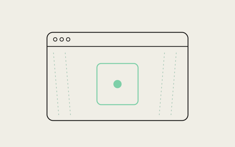
For a few weeks this year, opening a fresh window in Influxx on macOS meant staring into a flat black rectangle sitting in the exact center of an otherwise translucent, frosted-glass frame. Everything around it — the sidebar, the tab strip, the window edges — blurred the desktop behind it the way it was supposed to. The middle of the window didn't. It was just a hole. This is the story of what vibrancy is actually for, how a solid black void ended up sitting in the middle of ours, and why fixing it taught us more about restraint than it did about rendering.
What Vibrancy Is, and Why a Terminal App Would Bother
Vibrancy is Apple's name for the translucent, frosted-glass background effect you see throughout macOS — the blur behind Control Center, the softly diffused panel behind a Finder sidebar, the way a Spotlight search box sits over your desktop without fully hiding it. Under the hood it's a system-level material: the operating system samples what's behind a window's chrome in real time and blends it through a blur and a tint, so the window reads as part of the desktop rather than a rectangle pasted on top of it.
For a coding tool that's mostly terminal panes, sidebars, and text, it would be easy to assume vibrancy is a cosmetic afterthought. We don't think it is. Influxx is a desktop cockpit where developers spend hours at a stretch running agent sessions, and a window that feels like a boxed-in, generic cross-platform app versus one that feels genuinely native to the operating system it's running on is not a small difference in how the tool sits in someone's day. Vibrancy is one of the cheapest, highest-leverage ways to make a window feel lighter and less like an alien pane dropped onto the desktop. It's also one of the easiest effects to get subtly, embarrassingly wrong.
The Bug: A Black Hole Where the Glass Should Be
The symptom was blunt and impossible to miss once you saw it: under specific conditions, the center region of an Influxx window — where terminal panes live — rendered as a completely opaque, jet-black rectangle instead of the translucent glass background the rest of the window chrome was correctly showing. The sidebar blurred the desktop wallpaper behind it exactly as designed. The window's outer chrome did the same. And in between, sitting right where a developer's eyes spend the most time, was a flat, lightless void that broke the illusion completely.
It didn't happen everywhere or every time, which is what made it dangerous rather than merely ugly. It appeared under a specific combination of conditions: certain sequences of switching the window's chrome into glass mode, certain states after a terminal pane had been freshly opened but hadn't yet drawn any content, and certain transitions around window focus changes. A window that looked perfect on first launch could develop the black void a few interactions later, which meant a quick glance during development wasn't enough to catch it — you had to actually live in the window the way a real user would, clicking around, switching focus, opening and closing panes, before the bug would show itself.
Why It Was Worse Than a Normal Rendering Bug
A misaligned border or an off-by-a-few-pixels shadow is a cosmetic nuisance. This was structural in a way that mattered more: vibrancy is an all-or-nothing illusion. A window that's 90% translucent and 10% solid black doesn't read as "mostly glass with a minor flaw" — it reads as broken, because the eye immediately locks onto the one region that doesn't match its neighbors. A partial vibrancy failure isn't a smaller version of a working effect. It's a different, worse effect: it draws attention to itself instead of receding into the background the way vibrancy is supposed to.
Isolating Which Layer Was Unexpectedly Opaque
Vibrancy in a window like ours isn't one single surface — it's a stack of layers on top of each other: the operating system's blur material at the bottom, then the window's own background layer, then the individual panes and their contents on top of that. For the glass effect to work, every layer in that stack has to actually be transparent where it's supposed to be. It only takes one layer in the middle painting an opaque background — even briefly, even under one specific condition — to block everything the system is doing underneath it, and from the outside that looks identical to vibrancy not working at all, even though the blur material itself is rendering perfectly fine one layer down.
The debugging approach was mostly a process of elimination across that stack rather than a single insight. We'd toggle each layer's background to a bright, obviously-wrong test color one at a time and watch which one made the black void appear or disappear, working from the outside of the window inward. That narrowed the problem to a specific layer that was supposed to stay transparent once the window switched into glass mode, but in certain sequences was left holding a leftover solid background color from before the switch happened — a stale style that nothing downstream was clearing when the window's chrome mode changed.
Once we knew which layer was at fault, the second half of the work was figuring out exactly when the stale background got left behind. Terminal panes carry their own internal appearance state — colors, blur behavior, focus treatment — and that state wasn't always being recalculated when the surrounding window's chrome mode changed, or when a pane gained or lost focus. The layer wasn't intentionally painting black; it was just failing to notice that the world around it had changed and never got told to update.
"The hardest part wasn't finding a layer that was black — that part was almost mechanical, just swap in a bright test color at each layer and watch what breaks. The hard part was that the black only showed up after a sequence of events: switch to glass mode, then open a fresh pane, then click somewhere else. Any one of those steps in isolation looked fine. It only broke when you did them in the order a real person actually would."
— Sofia Marchetti, Desktop Platform Engineer, Influxx
Testing Across Every Window State, Not Just the Happy One
Once we had a fix, the harder question was proving it actually held. A vibrancy bug that only appears after a specific sequence of window-state changes is exactly the kind of bug that a single manual check will miss and a regression will happily reintroduce six months later. We built out a deliberate checklist rather than trusting a quick look: light mode and dark mode, since macOS computes the tint and blur differently in each; standard windowed mode versus fullscreen, since fullscreen changes how the system composites the window entirely; freshly launched windows versus windows that had been resized, moved, and had panes opened and closed repeatedly; and every combination of focus state, since the black void was tied in part to focus transitions in the first place.
Resize and fullscreen turned out to be their own small category of edge case. Fullscreen on macOS doesn't just make a window bigger — it changes which compositing path the system uses for a window entirely, and a vibrancy effect that survives a resize can still break the moment a window transitions into or out of fullscreen, because that transition rebuilds parts of the window's rendering context that a simple resize doesn't touch. We test both transitions independently now rather than assuming one implies the other.
Why We Don't Reach for Vibrancy Everywhere It Could Theoretically Go
The instinct after fixing a bug like this is to go looking for every other place in the app that could plausibly get the glass treatment and turn it on. We deliberately didn't do that, and we don't plan to. Vibrancy is a genuinely nice effect when it works, but a broken translucent window is a worse experience than a window that was honest about being opaque in the first place — an opaque panel just looks like a normal, functional app; a partially-broken glass panel looks like something is wrong with your computer. Every additional surface we make translucent is another surface that has to be defended against exactly this class of bug, forever, across every macOS version Apple ships next.
That's a real cost, and it means our answer to "should this panel be vibrant too" is closer to "only if we're confident we can keep it correct across every window state" than "sure, why not." Text-heavy panels in particular are a place we hold back deliberately — enough translucency behind dense text measurably hurts readability, and a slightly-less-native-feeling panel that's easy to read beats a beautifully glassy one that isn't.
"We could make a lot more of this app translucent than we currently do. The reason we don't is that vibrancy has a specific failure mode where it doesn't degrade gracefully — it doesn't get a little bit worse, it goes from looking native to looking broken. We'd rather ship fewer glass surfaces that are always correct than more that are sometimes a black hole in the middle of your screen. Visual correctness beats visual ambition every time we've had to choose between them."
— Theo Lindqvist, Founding Engineer, Influxx
The Honest Cross-Platform Note: This Entire Category Is a macOS Story
Vibrancy, as described here, is a macOS-specific system material — there's no equivalent primitive on Windows or Linux that behaves the same way, and we're not trying to fake one. Windows and Linux builds of Influxx use a deliberately simpler window chrome: solid, well-considered surfaces that respect each platform's own visual conventions rather than an approximation of the macOS glass effect layered on top of a different operating system's compositor. We think that's the more honest choice. A translucent effect that's subtly wrong because it's being emulated on a platform that was never designed for it would be the exact failure mode this whole article is about, just self-inflicted instead of a bug. Native polish, on every platform, means matching what that platform actually does well — not cloning one platform's signature effect everywhere else.
"I do most of my work on a MacBook Pro with three or four terminal panes open at once, and I genuinely didn't notice the vibrancy effect until the day it broke. I opened a fresh window and there was this ugly black square sitting dead center where my terminal was about to load. It was such a strange, specific thing to be bothered by, but once I saw it I couldn't unsee it. When the fix shipped a couple weeks later I actually felt it — the window just felt calmer again."
— Priya Raghunathan, senior backend engineer at a fintech startup, Influxx user
What We'd Still Like to Improve
The honest limitation here is one of process, not visuals: we don't yet have automated visual regression coverage that would catch this specific class of bug — a transparency failure that only appears after a sequence of window-state transitions — before a human eye does. Standard automated tests are good at asserting that a value is set correctly; they're much weaker at asserting that a window actually looks translucent across a dozen interleaved states. Until that tooling gap closes, this category of bug still depends partly on someone manually living inside the app through exactly the kind of session that exposed it the first time, which is a real cost every time we touch this part of the app.
Frequently Asked Questions
What is macOS vibrancy mode and why does it matter in a developer tool?
Vibrancy is the translucent, frosted-glass background material built into macOS, the same effect you see behind Control Center or a Finder sidebar. In Influxx it makes the window feel like a native part of the desktop rather than a boxed-in app pasted on top of it, which matters for a tool developers keep open for hours at a stretch.
Why did a black box appear in the middle of the Influxx window on macOS?
A specific rendering layer wasn't being told to clear its background when the window's chrome switched into glass mode under certain sequences of interaction, so it kept showing an old, opaque background instead of turning transparent. We isolated the layer, fixed the missing update, and added it to our manual test checklist across light mode, dark mode, resize, and fullscreen.
Is vibrancy available on Windows and Linux versions of Influxx?
No, and we don't fake it. Vibrancy is a macOS system material with no true equivalent on other platforms. Windows and Linux builds use a deliberately simpler, solid window chrome suited to each platform's own conventions, rather than an imitation of the macOS effect.
Why doesn't Influxx use vibrancy on every panel in the app?
Because translucency behind dense, text-heavy content measurably hurts readability, and because every additional translucent surface is another surface that has to be defended against the same class of rendering bug described in this article. We'd rather use vibrancy on fewer surfaces and keep it correct than use it everywhere and risk it breaking.
How do you test for a rendering bug that only shows up sometimes?
By building a deliberate checklist instead of trusting a quick visual glance: light mode and dark mode, standard and fullscreen windows, freshly launched and heavily interacted-with windows, and every relevant focus-state transition. Bugs tied to a sequence of interactions rather than a single state need to be tested as sequences, not snapshots.
Does enabling transparency effects on macOS slow down Influxx?
We haven't seen a meaningful performance cost from the vibrancy material itself — the operating system handles the blur compositing efficiently. The engineering cost we do pay is correctness, not performance: keeping every layer in the window honestly transparent when it's supposed to be, across every state a real session moves through.
Why does a translucent window matter if it's purely visual?
Because purely visual details are exactly what tells a user, often subconsciously, whether a tool feels considered or generic. A window that respects the operating system's own visual language reads as native and trustworthy; one that doesn't reads as an app that was ported in rather than built for the platform it's running on.
The black void in the middle of our own window was, in the end, a small bug with an outsized lesson: an effect this subtle only works if it's correct everywhere, all the time, which is a much higher bar than "correct in the demo." We'd rather ship less vibrancy than ship vibrancy we can't stand behind in every window state a real developer will actually hit — and the fix that closed this bug is also the reason we're in no hurry to spread the effect any further than we're confident we can keep it right.