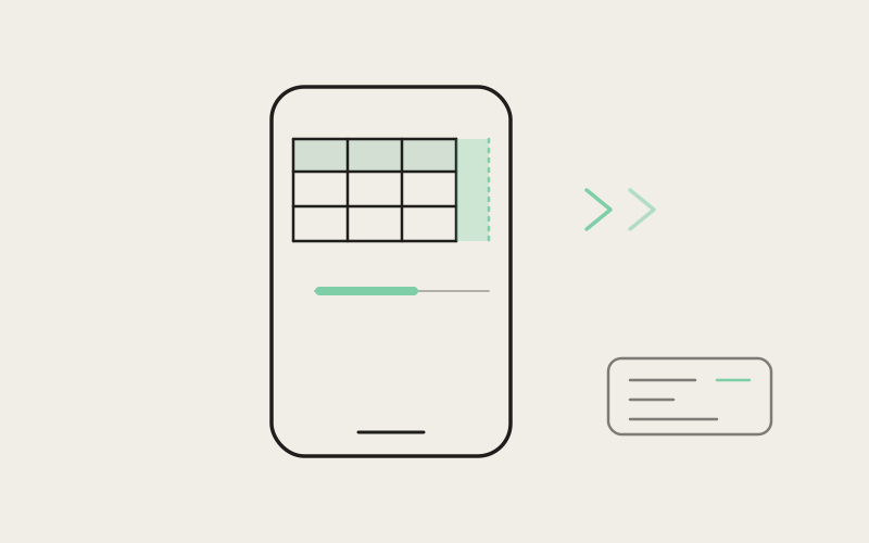
Ask an agent to compare three approaches, list the files it touched with line counts, or summarize a migration plan, and it will very often answer with a markdown table — because a table is the correct shape for that answer. The problem is that the table was generated with no idea it would be rendered on a 390-pixel-wide phone screen inside a chat bubble that itself has padding on both sides. Influxx Mobile 1.2 includes a small, focused layout module that decides, cell by cell, whether that table should stretch to fit the screen or scroll horizontally — and the decision changes depending on how many columns the agent actually sent back.
Why a Desktop-Shaped Table Breaks on a Phone
A markdown table with two or three columns — a ranking, a before/after comparison, a short key-value list — reads fine almost anywhere, because there's enough width to give each column a fair share. A table with six or eight columns — a file listing with path, status, additions, deletions, and owner — was never going to fit a phone screen at any font size. Treating both cases the same way is where most naive renderers fail: either every table gets squeezed until the text wraps into an unreadable stack, or every table gets a horizontal scrollbar, including the three-column one that didn't need it and now has awkward dead space on the right.
The module responsible for this decision in Influxx Mobile lives in a single file, mobile-markdown-table-layout.ts, and it does one thing: given the available width and the number of header cells a table declares, it returns a small object describing exactly how wide each cell should be and whether the table should scroll.
Two Layouts, One Decision Point
The exported function, resolveMobileMarkdownTableLayout(contentWidth, headerCount), branches on a single threshold: three columns.
Three Columns or Fewer: Stretch to Fit
When a table has three or fewer columns, the layout sets fitViewport: true and divides the available width evenly — cellMinWidth becomes Math.floor(width / columnCount), and tableWidth is pinned to the full available width. The comment in the source is explicit about why: "1–3 columns usually fit a phone; force equal share so ranking tables don't clip the last column." Without that even split, a three-column comparison table could end up with its last column crushed against the screen edge or, worse, silently clipped. Forcing an equal share means every column gets exactly the same guaranteed width, and the table fills the chat bubble edge to edge with no dead space.
Four Columns or More: Scroll With a Readable Floor
Past three columns, the module switches strategy entirely. Rather than keep shrinking columns to fit — which is how you end up with six-character-wide cells nobody can read — it sets fitViewport: false and computes a minimum cell width clamped between 100 and 140 pixels: Math.max(100, Math.min(140, Math.floor(width / 2.6))). The table is allowed to become wider than the screen, with a cell max width capped at 200px, and the surrounding view becomes horizontally scrollable. The / 2.6 divisor is doing something specific: it's tuned so that roughly two and a half columns are visible at once, which means the next column is always partially cut off at the right edge. That half-visible column is the layout's way of telling you, without a scrollbar or a label, that there's more to see if you swipe.
"The easy version of this is 'shrink everything until it fits.' We tried that first and it produces tables where every cell wraps to three lines of four-character fragments. The fix wasn't a smarter shrinking algorithm — it was accepting that some tables are just wider than a phone, and the job is to make that legible and scrollable instead of pretending it can be squeezed away."
— Daniel Osei, Mobile Engineer, Influxx
The Shell That Owns the Scroll
The layout numbers on their own don't render anything — MobileMarkdown.tsx is what turns them into a table. Each table block is wrapped in an outer shell view with rounded corners and overflow: 'hidden', so the border radius clips cleanly, and an inner ScrollView with horizontal set owns the actual scrolling. That split matters: if the shell and the scroll container were the same view, clipping the corners would also clip the content you're trying to scroll to. The ScrollView only shows its horizontal scroll indicator when !layout.fitViewport — a stretched three-column table doesn't get a scrollbar hint because there's nothing to scroll to under normal conditions, while a wide table always shows one so the ability to scroll is discoverable rather than something you stumble into.
Capping Rows and Columns Before Layout Ever Runs
Before any width math happens, MobileMarkdown.tsx applies two hard caps: MAX_TABLE_COLUMNS (8, re-exported from the layout module) and a local MAX_TABLE_ROWS of 40. An agent that returns a 30-column diagnostic dump or a 400-row data export doesn't get to hand all of that to a phone's layout engine — only the first 8 columns and first 40 rows are rendered. If anything was cut, a small truncation line appears under the table: "N more rows", "N more columns", or both, separated by a middot when both apply. This is a deliberate trade — a giant table was never going to be usable by scrolling through it on a phone anyway, and the cap keeps rendering fast and the layout math bounded, while still telling you honestly that you're looking at a partial view.
"I asked the agent to list every file it touched in a big refactor and it came back with something like nine columns. On my phone it just... scrolled, smoothly, with a little sliver of the next column peeking in so I knew to swipe. It's such a small thing but it's the difference between actually reading the table and giving up and asking for a shorter summary instead."
— Renata Okafor, mobile developer, Influxx user
Chat Bubbles Get Less Room Than Full-Width Previews
The available width passed into resolveMobileMarkdownTableLayout isn't just the screen width — it's the screen width minus an inset that depends on where the table is rendered. Tables inside the native chat variant subtract CHAT_TABLE_HORIZONTAL_INSET (48px), while tables rendered elsewhere — file previews, task descriptions — subtract a smaller DEFAULT_TABLE_HORIZONTAL_INSET (32px). Chat bubbles sit inset from the screen edges to leave room for surrounding chrome, so a table rendered inside one has less real width to work with than the same table rendered in a full-bleed preview, and the layout accounts for that difference before it ever decides between stretch and scroll. The chat variant also swaps the typography entirely — serif body font matching the rest of the assistant's prose, versus a denser system-sans used in file and task previews — so a table doesn't visually jump out of the surrounding text.
What Happens When You Pinch to Zoom
Native chat supports pinch-to-zoom text scaling, and table cells scale with it. Every cell's text style runs through a shared scaleStyle helper that multiplies font size and line height by the active textScale, so a zoomed-in table keeps its text readable rather than clipping inside a now-too-small fixed cell. This is also why the fitViewport path still allows horizontal scrolling even though it's supposed to fit exactly: the scroll indicator only hides by default, it doesn't get disabled, so a three-column table that grows past the viewport under heavy zoom can still be scrolled instead of getting stuck.
A Small Module, Deliberately
None of this tries to be a general markdown-table renderer with configurable themes or arbitrary column alignment. It's a narrow calculation — given a width and a column count, decide stretch or scroll, and pick numbers that keep either choice legible — wired into one rendering path. That narrowness is what makes it testable in isolation: the module's own test file checks the three-column stretch case, the six-column scroll case, and the eight-column cap, entirely independent of React Native or the surrounding chat UI. A table is one of the more common ways an agent's answer arrives shaped wrong for a phone, and fixing that didn't need a bigger markdown engine — it needed one function that knows when to stop trying to make everything fit.
"A lot of mobile AI products treat markdown rendering as a checkbox — does it render, yes or no. We spend real engineering time on cases like an eight-column table because that's exactly the kind of output a coding agent produces constantly, and if it looks broken on the phone, people stop trusting the mobile app for anything but reading short replies."
— Marcus Whitfield, Head of Product, Influxx
Frequently Asked Questions
Does Influxx Mobile shrink table text to force wide tables to fit the screen?
No. Past three columns, the layout deliberately stops trying to shrink cells to fit and instead sets a readable minimum cell width (100–140px) and lets the table scroll horizontally rather than compress text into unreadable fragments.
Is there a limit on how many rows or columns a table can show?
Yes. Columns are capped at 8 and rows at 40. If a table exceeds either limit, the rendered table shows only the first 8 columns and first 40 rows, with a note underneath stating how many rows and/or columns were hidden.
Why do some tables have a scrollbar and others don't?
Tables with four or more columns always show a horizontal scroll indicator, since they're wider than the screen by design. Tables with three or fewer columns are stretched to fit the full width and hide the indicator by default, since there's normally nothing to scroll to.
Do tables look different inside a chat message versus a file preview?
Yes. Chat-variant tables use less available width (a larger inset, since chat bubbles sit inset from the screen edge) and a serif font matching the surrounding assistant prose, while tables in file and task previews use a denser system-sans font and a smaller inset.
What happens if I pinch-zoom the text while a table is on screen?
Table cell text scales along with the rest of the message's text scale, and the table remains scrollable if the zoomed content grows past the available width, even for tables that normally fit without scrolling.
Does this layout logic handle non-table markdown differently?
No — this specific module only computes table cell widths and scroll behavior. Other markdown elements (headings, lists, code blocks, images) are handled by separate rendering paths in the same file.
The fix for a wide table on a narrow screen was never going to be a cleverer renderer — it was a small, testable function that knows the difference between a table that can fit and one that can't, and treats those two cases honestly instead of forcing one solution onto both.