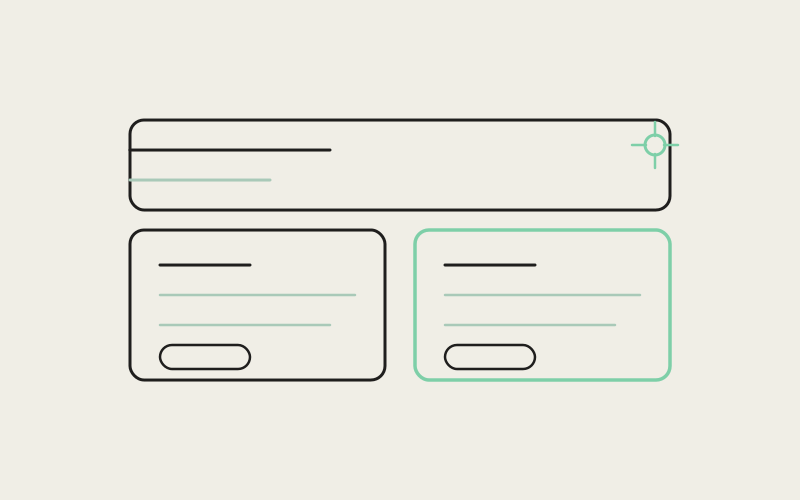
No customer files a ticket that says "your pricing cards disappear at a certain screen width" or "your hero used to feel more like you." They just quietly bounce, and you never find out why. As part of the Influxx 1.2 release wave, a chunk of the work wasn't a new feature at all — it was going back through the marketing site itself and fixing the small things that had drifted: a pricing toggle that could hide a plan instead of just highlighting one, a hero and nav that had wandered from the site's own visual language, and a 3D product demo that didn't always sit inside its own frame. None of it is a headline. All of it is the kind of thing a careful visitor notices.
The Site Is a Product Too
It's easy to treat a marketing site as a static asset — build it once, ship the app, move on. But a site is a piece of software with its own components, its own state, and its own edge cases, and it degrades the same way any codebase does: one small compromise at a time, each one reasonable on its own, until the accumulation reads as carelessness. A visitor doesn't experience "we shipped a pricing toggle bug" and "we experimented with a different hero layout" as two unrelated events months apart. They experience one visit, and if two different things feel slightly off during that visit, the impression is a site that isn't quite finished — even if the actual product underneath is solid.
That's the frame for this pass: not "add something new," but "make the existing surface tell the truth consistently."
Two Plans, Every Width
Influxx's homepage pricing section — PricingSection4 — shows a Monthly and an Annual plan side by side, with a small pill toggle above the cards that lets a visitor highlight which cadence they're leaning toward. The intent was always for that toggle to be cosmetic: it accents one card, it doesn't hide the other or rewrite the numbers on screen. At some point that intent and the implementation came apart, and the toggle could behave more aggressively than designed — swapping which card was visible, or repricing into yearly totals, instead of just shifting emphasis.
The fix, shipped as part of this pass, made the two-plan grid unconditional: both cards render, both show their price in the same monthly-unit terms ($20/month billed monthly, $16/month effective billed annually), and the toggle's only job is to nudge which card gets the highlighted ring and shadow. A code comment left in the component spells out the constraint plainly — the toggle "does not swap card set or reprice to yearly totals." Because the grid uses a standard responsive layout that collapses from two columns down to a single stacked column on narrow viewports, the same rule holds regardless of screen width: whether you're comparing the two side by side on a laptop or scrolling through them stacked on a phone, you see two real plans with two real, correctly-labeled prices — not a toggle that quietly hid the one you needed to compare against.
This matters more than it sounds like it should, because pricing is the one section of a site where a visitor's trust is thinnest. If the numbers look inconsistent, or a plan seems to vanish depending on how you interact with a toggle, the most natural conclusion isn't "minor UI bug" — it's "maybe I can't trust what this page is telling me the product costs."
"The toggle was only ever supposed to be a highlight, not a data mutation. Once we traced through the actual render logic, it was obvious the fix wasn't a new feature — it was deleting the code path that let the toggle change what data got shown at all. Both cards, both real prices, always. The toggle's whole job shrank down to one CSS ring."
— Dana Whitfield, Frontend Engineer, Web Platform at ETAPX
Coming Back to the Site's Own Voice
The homepage hero and top navigation went through a round of experimentation — different layouts, different chrome — the kind of exploration that's healthy for a design system to go through periodically. But experimentation has to resolve into a decision, and for a while the site sat in a state that didn't fully commit to either the old language or the new one. This pass restored the site's classic chrome: the tagline and "powered by" line parked with the download pills bottom-right over the hero video, the full wordmark, and a navigation bar with wavy-underline links and a glass treatment that activates once you've scrolled past the hero.
The component comments left behind describe the intent directly — the hero is built as "classic etapx left-chrome," and the nav is "classic etapx site chrome," transparent while it floats over a dark hero and switching to a glass background once the page scrolls onto regular content. That's not a cosmetic preference stated for its own sake; it's the site re-committing to one visual identity instead of splitting the difference between two.
Why "Going Back" Counts as Progress
There's a temptation to treat any revert as a step backward. In practice, resolving an in-between state — even by choosing the earlier of two options — is often the more disciplined move, because a site that's confidently one thing reads as intentional, while a site caught between two unfinished ideas reads as unfinished, period.
A Laptop That Actually Fits Its Frame
The homepage's interactive MacBook — a real 3D model rendered in the browser, its screen driven by a live canvas texture showing a scripted Influxx session — is the kind of showcase element that's disproportionately fragile relative to how simple it looks. The component that renders it, MacbookShowcase, carries several small defensive fixes that only make sense if you've watched the demo fail in the wild: the canvas container is forced to fill its parent at exactly 100% width and height, the actual mount is deferred by one animation frame so the surrounding layout has real dimensions before the 3D canvas claims any space, and the model's scale is computed separately for mobile and desktop breakpoints rather than assuming one size fits both.
Those aren't incidental details — they're the difference between a demo that sits cleanly inside its card at any viewport and one that renders at the wrong size, blinks in and out, or spills past its own edges before settling. The code comments call out the exact failure modes being guarded against: a canvas mounted before its container has real layout size is "a common 'blinks in/out' cause," and the container's dimensions are pinned with an explicit !important override specifically so the canvas can't drift from the frame around it.
"I was showing a coworker the site on my phone and the laptop demo used to just cut off at the edge of its box — you could see maybe two-thirds of the screen. I checked back after the update and it's fully inside its frame now, scaled properly for mobile instead of just shrunk. Small thing, but it's the kind of small thing that makes you trust the rest of the page more."
— Owen Castellanos, DevOps engineer at a fintech infrastructure company, Influxx user
Why Small Inconsistencies Compound
None of these three fixes touch the actual product — the desktop cockpit, the agent orchestration, the terminal integrations. They touch the twenty seconds before a visitor ever opens the app: the page that convinces them it's worth trying. A pricing toggle that hides a plan doesn't make the underlying subscription system wrong, but it makes the page describing that system look untrustworthy. A hero caught between two visual identities doesn't break any functionality, but it makes the brand look indecisive. A demo that clips at the edge of its own card doesn't affect anyone's actual workflow, but it's the first thing a skeptical visitor's eye catches.
Individually, each of these is a rounding error. Together, across one visit, they're the difference between a site that feels like it was built with the same care as the product it's selling, and one that feels like an afterthought bolted on after the "real" work was done.
"We don't get credit for a homepage that works. Nobody emails us to say the pricing cards rendered correctly. But we absolutely lose trust the moment they don't — and that trust is expensive to earn back. Treating the marketing site with the same review rigor as the app isn't generosity, it's just recognizing that it's the first product surface almost everyone sees."
— Marcus Feld, Head of Product at ETAPX
What This Pass Deliberately Didn't Do
It's worth being explicit that this wasn't a redesign. No new sections were invented, no new visual language was introduced, and no pricing or plan structure changed. Every fix in this pass was in service of making the existing design do what it was already supposed to do — correctly, and at every screen size. That restraint is itself part of the craft argument: the fastest way to erode trust in a design system is to keep layering new ideas onto components that don't yet reliably execute the old ones.
Frequently Asked Questions
Did the pricing itself change, or just how it's displayed?
Only the display behavior changed. The Monthly and Annual prices are the same plans as before — the fix was making sure both cards render with the correct monthly-unit price at every screen width, regardless of which cadence is highlighted.
Was the hero video or its content replaced?
No. The hero's video background and core content stayed the same. What changed was the surrounding chrome — the tagline, powered-by line, download pills, and wordmark placement — returning to the site's established layout after a period of experimentation.
Is the interactive MacBook demo a video, or is it actually rendering the model live?
It's a real 3D model rendered live in the browser, with its screen driven by a canvas texture that's redrawn continuously to simulate a scripted Influxx session — not a pre-recorded video loop.
Does this pass affect page load performance?
These were correctness and layout fixes, not a performance initiative. The canvas-mounting and sizing fixes are more about visual stability (avoiding flicker and clipping) than about load time.
Will the marketing site keep experimenting with new layouts in the future?
Almost certainly, in a healthy design system. The point of this pass wasn't to freeze the site in place — it was to make sure any period of experimentation resolves into one committed state rather than leaving the page stuck between two.
Does "Influxx 1.2" refer to a specific app version number?
No — it's the name for this release wave, covering a set of desktop, mobile, and website changes shipped together, not a literal build number.
Were these bugs affecting revenue or signups in a measurable way?
That's not something we're going to speculate on publicly. What we can say is that a pricing section that can hide a plan, or a demo that clips its own frame, is objectively worse than one that doesn't — regardless of how it moved any specific metric.
A marketing site rarely gets praised for being unremarkable — it just quietly stops being a reason someone hesitates. That's the bar this pass was aiming for.