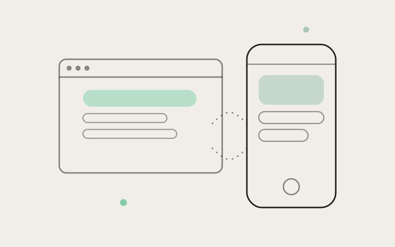
You close your laptop mid-afternoon, thumb open the Influxx app on the train, and for a second nothing about it asks you to re-orient. The window chrome on your desktop and the screens on your phone now share the same visual language — a light, translucent "glass" surface that lets a hint of what's behind it show through, instead of a flat, opaque panel sitting on top of everything. We shipped it to desktop and mobile at the same time, on purpose, so neither one ever felt like the version we got to eventually.
Why It Matters When Two Apps Stop Looking Like Two Apps
It's easy to treat visual consistency as the least urgent kind of polish — something you get to once the real features are done. We don't think that's right, and we've come around to thinking it's almost backwards. The first few seconds after you open any app are when you're deciding, mostly without noticing you're deciding, whether you trust what you're looking at. A desktop app and a mobile app that share a name but not a feel put a tiny tax on that moment every single time you switch between them. Nothing is broken, exactly — but something feels slightly off, like walking into a store you know well and finding the shelves rearranged overnight.
Multiply that small tax by how often people actually move between devices in a day. You start something at your desk, check on it from your phone at lunch, come back to your desk to finish it. If the desktop window and the phone screen look like they were designed by two different teams a year apart, every one of those handoffs asks you to re-learn, in some small way, what "the app" is supposed to look like. If they look like the same product, that tax disappears, and what's left is just the work.
What "Glass" Actually Looks Like, and Why It's Different From Flat Color
Glass, as a design choice, is the opposite of a flat, solid-color interface. A flat panel is opaque — it's a rectangle of one color sitting in front of whatever's underneath it, and that's the whole story. A glass panel is translucent — it lets a soft, blurred hint of what's behind it bleed through, so the surface reads as sitting slightly above the rest of the interface rather than replacing it outright. It's layered instead of stacked. It has a bit of depth to it, and a bit of light moving through it, instead of being a single flat coat of color.
That difference sounds subtle described in words, and in a lot of ways it is subtle — nobody is going to stop what they're doing to admire a translucent title bar. But subtle isn't the same as unnoticed. A flat interface can feel static, almost inert, the same way a room lit by one overhead bulb feels different from one with a window in it. Glass introduces the sense that the interface is a little bit alive — that there's something happening just behind the surface you're looking at, even when that something is just the rest of your own screen.
Desktop Window Chrome, Not Just In-App Panels
On desktop, this shows up in the window chrome itself — the title bar and frame around your Influxx window, the part of the app that's technically outside any individual screen you're looking at. That's a more ambitious place to put a glass treatment than a card or a modal buried three screens deep, because the chrome is what you see every single time you glance at the app, whether you're deep in a session or just checking whether something finished. Getting that part right mattered more to us than getting any one interior screen right, because it's the part nobody ever gets to skip past.
Mobile Screens, Not Just a Splash of Accent Color
On mobile, the same idea runs through the screens you actually spend time in — not as a coat of paint slapped onto a redesign, but as the same underlying visual grammar as the desktop chrome, adapted to a phone's smaller surface and different lighting conditions. The goal wasn't "make mobile look nice too." It was "make mobile speak the same visual language desktop just started speaking," so the two don't drift into looking like separate products that happen to sync data.
"We've watched people notice, without being able to say exactly why, when a product's mobile app looks like an afterthought next to its desktop counterpart. It reads as a signal about how much the company actually cares about the part of the experience you're looking at in that moment. We didn't want anyone opening Influxx on their phone and getting a quieter version of that signal, even by accident."
— Devon Okafor, Design Systems Lead, Influxx
Why We Refused to Ship One Platform First
The easier path, honestly, would have been to ship glass chrome on desktop, let it sit for a release or two, gather feedback, and bring mobile along later once we'd worked out the rough edges. That's how a lot of cross-platform visual work happens, and there's a real argument for it — you learn from the first platform before committing the second one to the same choices.
We didn't take that path, deliberately. Staggering a visual change like this has a quiet cost that's easy to underweight: whichever platform goes second spends real time looking like the neglected one, even if nobody ever says that out loud internally. People notice which product gets the nice new look first and which one waits — and once a phone app is visibly the "older-looking" sibling to its desktop counterpart, it tends to stay read that way even after it eventually catches up. We didn't want mobile users treated as a later concern, and we didn't want desktop users to feel like mobile was riding on their coattails either. Shipping together was slower to plan and coordinate than doing one platform at a time would have been. We think that coordination cost was worth paying so that nobody's version of Influxx was the one that got the leftovers.
"I run agents from my desktop all day at work, then check on them from my phone on the walk home. Before this, opening the phone app after a day on desktop felt like switching to a slightly cheaper version of the same thing — same features, different mood. Now it just feels like the same app followed me out the door. That's a small thing to put into words but it changed how often I actually check in from my phone instead of waiting until I'm back at my desk."
— Priya Nakamura, engineering manager, Influxx user
The Trade-Off We're Honest About: Glass Needs More Care to Stay Readable
A translucent surface is, by definition, letting something else show through it, and that's exactly where a flat, opaque panel has an easier time of it. A solid color behind your text is always exactly as readable as you designed it to be, no matter what's around it. A glass panel's readability depends partly on what's sitting behind it — a bright window, a busy desktop background, a phone screen in direct sunlight — and that's a variable a flat design simply doesn't have to deal with.
We're not going to pretend that's a solved problem, because it isn't, and treating it like a one-time launch item instead of an ongoing balance would be the wrong way to talk about it. Getting glass to look right in a dim room and stay legible on a phone screen at noon on a sidewalk is a genuine tension, not a settled fact. The design keeps getting tuned — how much of what's behind the panel shows through, how much contrast sits on top of it, where a plainer, more opaque treatment makes more sense than a translucent one — because "looks great in a screenshot" and "stays readable in every lighting condition a phone actually lives in" are two different bars, and only one of them is easy to clear.
If you've found a specific spot where text is harder to read than it should be against a busy or bright background, that's exactly the kind of rough edge we want to keep hearing about, because it's the input that tells us where the balance still needs adjusting.
What This Looks Like on an Ordinary Day
Picture the version of your day this is actually meant for. You open your laptop first thing in the morning, and the Influxx window comes up with that same soft, layered chrome you saw yesterday — nothing to relearn, nothing that looks like it shipped a version behind. Midday, you're between meetings and you pull out your phone to check whether an agent finished a task you kicked off before lunch — the screen you land on has the same weight and depth to it as the desktop window you were just looking at an hour ago, not a plainer, flatter stand-in for it. Later, you want to show a teammate something on your phone that you'd been doing on your laptop — you're not having to explain why the two versions look like they came from different eras of the product.
None of those moments are dramatic. That's sort of the point. Visual consistency isn't a feature you experience once and remember — it's the thing that quietly stops asking anything of your attention every time you move between your devices, which is exactly the kind of improvement that's easy to undervalue and easy to miss once it's gone.
"People assume shipping the same look on two very different platforms at once is mostly a design decision. In practice it's just as much a scheduling and coordination decision — deciding that neither team gets to treat the other platform as something to catch up on eventually. That's the part I'd want people to know actually took the deliberate choice, not just the visual design itself."
— Marcus Idehen, Director of Product Engineering, ETAPX
Frequently Asked Questions
What does "glass" mean in an app's design, exactly?
It means a translucent surface rather than a flat, solid-color one — a panel that lets a soft, blurred hint of what's behind it show through, so it reads as sitting slightly above the interface instead of just being a flat rectangle placed on top of it. It's a layered, softer look compared to a fully opaque panel.
Did Influxx redesign the whole app, or just the chrome and a few screens?
This change is specifically about the surfaces you look at constantly — the desktop window's chrome and frame, and the core screens on mobile — rather than a full ground-up redesign of every feature. The goal was consistency in how the app presents itself, not a reinvention of what it does.
Why does it matter if desktop and mobile don't look exactly the same?
Because most people don't use just one of them. If the two look and feel like different products, every time you move between your laptop and your phone you spend a small amount of attention re-orienting to a different visual style. Matching them removes that friction, so switching devices feels like continuing the same session rather than starting over somewhere new.
Is a translucent interface harder to read than a solid one?
It can be, depending on what's behind it — a bright window, a busy background, or direct sunlight on a phone screen all make a translucent surface more demanding to keep legible than a flat, opaque one. We're upfront that this is a real trade-off and an ongoing balance, not something we consider finished. If you run into a spot where text is hard to read, that's useful feedback we want.
Why ship this on desktop and mobile at the same time instead of one first?
Because staggering it means one platform spends real time looking like the neglected one, even if that's never anyone's intention. We coordinated the release deliberately so neither desktop users nor mobile users ended up feeling like they got the later, lesser version.
Do I need to turn this on, or change any settings?
No. This is how the desktop window chrome and the mobile screens look by default — there's nothing to enable and no setting to find.
Will this visual style keep changing, or is it done?
It will keep getting refined. The balance between how translucent a surface looks and how readable it stays in different lighting is something we continue to tune based on real use, rather than a decision we consider locked in place.
None of this changes what Influxx does for you — it changes how it feels to move between the places you do it. That's a smaller promise than a new feature, but it's the one you notice every single time you close your laptop and open your phone, whether or not you ever stop to think about why it feels the same. We'd rather it just feel that way, quietly, every time.