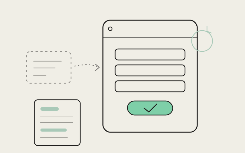
You hear about a tool from a teammate, click the link on your phone during lunch, and decide in the first ten seconds whether it's worth your time. That's the whole game. Influxx's sign-up used to ask you to make that decision from inside a small popup window stacked on top of the page you were already looking at, with an extra question in the middle that had nothing to do with getting you into the product. It's a full page now, the extra question is gone, and the legal pages you'd occasionally check on the way in finally look like they were written by people who read them.
The First Five Minutes Decide Everything Else
Nobody judges a piece of software by its best feature first. They judge it by whatever happens between clicking "sign up" and seeing something useful on screen. If that stretch feels cramped, confusing, or padded with steps that don't obviously matter, a chunk of people quietly close the tab and never come back to find out if the actual product was good. They never got far enough to know.
That's a strange kind of failure, because it has nothing to do with whether the product works. A tool for running AI coding agents in parallel across your projects can be genuinely useful and still lose someone in the driveway, before they've touched a single feature, purely because getting in the door felt like more trouble than it needed to be. First impressions in software aren't really about the product. They're about the five minutes before the product.
We'd been treating that stretch as an afterthought — a popup bolted onto the marketing site, doing its best in a few hundred pixels of width. It worked. It just didn't feel like it belonged to the same product as everything after it.
From a Popup to a Real Page
The old sign-up lived in a drawer that slid out over whatever page you were already on. It was fine for a quick login if you already knew what you were doing, but it was a bad place to ask someone to create an account for the first time — the two of you were essentially sharing the same square footage as your homepage, your nav bar, and whatever else happened to be behind it. There wasn't room to explain anything, so nothing got explained. You just got a form.
Sign-up and log-in now live on their own pages — /login, /signup, and a proper password-reset flow behind them. That sounds like a small architectural detail, but it changes what the screen is allowed to do. A full page has room to breathe. It can put the form where your eyes actually land instead of squeezing it into a sidebar. It can show you what you're signing up for instead of just where to type your email. And it means the browser's own back button, bookmarks, and password manager all behave the way you'd expect them to, because you're looking at an actual page with its own address instead of a floating panel that happened to be open.
None of this changes what Influxx does once you're in. It changes whether the ten seconds before that feel like stepping into a considered space or squeezing through a gap.
"A popup is a great pattern for a quick action on a page you're already committed to — confirming something, checking a setting. It's a bad pattern for the single moment where someone is deciding whether to trust you with an account. That decision deserves a full page, not a corner of one."
— Devon Okafor, Design Systems Lead, Influxx
The Step We Took Out
The old flow also asked new users to confirm their age partway through sign-up, as a standalone step wedged between the basics and actually finishing. It wasn't a hard question, and it took maybe three seconds to answer. But three seconds of friction in a five-step flow isn't really three seconds — it's a moment where someone has to stop, read something unexpected, and decide whether to keep going, right when they're least invested in the outcome. Influxx is a developer tool. The step wasn't protecting anyone or unlocking anything; it was just there, adding a beat of "wait, why is it asking me this" to a process that should feel like a straight line from "I want to try this" to "I'm in."
We took it out. Sign-up is now the steps that actually matter — who you are, how you'll get back in — and nothing else. It's a small change on paper. In practice it's the difference between a flow that feels like a straight hallway and one that feels like it has a random door in the middle you have to open before you can keep walking.
Why We Didn't Just Trim the Copy Instead
The tempting middle option was to leave the step in but make it shorter — fewer words, a single tap instead of a question. We talked about it and decided that missed the point. The problem was never how the step was worded. It was that it existed at all, as a thing standing between "I decided to try this" and actually trying it. Trimming a step that shouldn't be there just makes it a smaller obstacle instead of no obstacle. We'd rather have four steps that each earn their place than five where one of them is just standing there being harmless.
Being Honest About the Trade-Off
A full page is not automatically better than a popup in every respect, and it's worth saying so plainly. A popup that's already sitting quietly in the corner of the page opens the instant you click it — there's nothing to load, because it was already loaded. A full page has to actually go somewhere: a new address, a new screen, a beat where the browser is doing its job before you see anything. On a fast connection that beat is barely noticeable. On a slow one — spotty airport wifi, a train losing signal for a second — it's a real, measurable pause that the old popup simply didn't have.
We think that pause is worth paying. A second of loading is forgettable. A cramped, claustrophobic first screen is not — it's the kind of thing that colors how someone feels about everything that comes after it, even once they've forgotten the specific reason why. But we're not going to pretend the trade doesn't exist. If you're the kind of person who notices every extra network round-trip, you will notice this one. It's the honest cost of a page that actually has room to explain itself.
"I'd bounced off Influxx once before — not because of anything the product did, just because signing up felt like filling out a form in a phone booth, and then there was some age question I wasn't expecting that made me close the tab out of pure confusion about why a coding tool needed to know that. A coworker sent the link again a few weeks later and I almost didn't click it. This time it was just... a page. Name, email, password, done. I was looking at my first project within a minute of landing on the site."
— Marcus Delgado, engineering manager at a logistics software company, Influxx user
The Small Fix Nobody Asked For, But Everyone Benefits From
While the team was in the sign-up flow, they also fixed something adjacent that had been quietly annoying for a while: the terms and privacy pages used an accordion layout where each section had a heading you could click to expand, and under certain conditions those headings would collapse down to an empty bar — the title text just wasn't there anymore, leaving you staring at a row you couldn't identify. It was never dangerous and it wasn't every section, but if you were the kind of person who actually reads the terms before agreeing to them — and some people genuinely are, especially right after creating an account — landing on a mystery blank bar was a bad note to end on.
That's fixed now. Section titles stay put whether the section is open or closed, the way you'd expect an accordion to behave. It's a small thing, but it's exactly the kind of small thing that either builds trust or quietly chips away at it, right at the moment someone is deciding whether to hand you their email address.
What This Looks Like on an Actual Morning
Picture the ordinary way people actually arrive at a tool like this. You're scrolling through a group chat before your first coffee and someone drops a link with "you should try this for the agent stuff." You tap it. If what greets you is a form fighting for space against a marketing page's nav bar, followed by a question you didn't expect, the whole thing reads as slightly unfinished — and unfinished sign-up experiences make people assume the product behind them is unfinished too, whether or not that's fair.
Now the same moment: you tap the link, land on a clean page that's just about getting you signed up, fill in three fields, and you're through. No detour, no surprise question, no guessing why a field disappeared. The page took a hair longer to show up than a popup would have. You didn't notice, because you weren't staring at a loading spinner — you were reading the two sentences the page had room to include about what happens next. That's the entire point of giving this moment more space: not to slow anyone down, but to spend the time you do ask for on something that actually helps, instead of nothing at all.
Frequently Asked Questions
Do I need to verify my age to sign up for Influxx?
No. That step has been removed from sign-up entirely. Creating an account now only asks for what's actually needed to set up and secure your account.
Why does Influxx sign-up open on its own page instead of a popup now?
A full page gives the sign-up flow room to explain itself clearly instead of squeezing a form into a small window on top of another page. It also plays more predictably with your browser's back button, bookmarks, and saved passwords.
Does the new sign-up page take longer to load than the old popup?
It can take a moment longer, since a full page has to load on its own rather than reusing a panel that was already open. On most connections the difference isn't noticeable; on a slow connection you may notice a brief pause before the page appears.
Is signing up for Influxx still free?
Yes — getting an account set up costs nothing and doesn't require a card up front. Nothing about this change affects what it costs to get started.
Why were the terms and privacy page sections showing up blank?
A display issue in the expandable section layout could cause a section's title to disappear when it collapsed, leaving an unlabeled bar in its place. That's been fixed — section titles now stay visible whether the section is open or closed.
Do I need to redo anything if I already had an Influxx account before this change?
No. Existing accounts are unaffected — this only changes what the sign-up and log-in screens look like and how many steps they contain, not anything about accounts that already exist.
Can I still get to sign-up and log-in from a link or bookmark?
Yes, and more reliably than before. Because sign-up and log-in are now real pages with their own addresses, they can be linked to, bookmarked, and reopened directly, instead of only being reachable by clicking a button on the homepage.
None of this is a new feature in the way a product update usually means it. Nothing got faster to run, nothing got smarter. What changed is the first minute — the one where someone who's never used Influxx decides whether the next four minutes are worth their time. It's a small thing to spend care on. It's also, for a lot of people, the only part of the product they'll ever judge before deciding whether to see the rest of it.