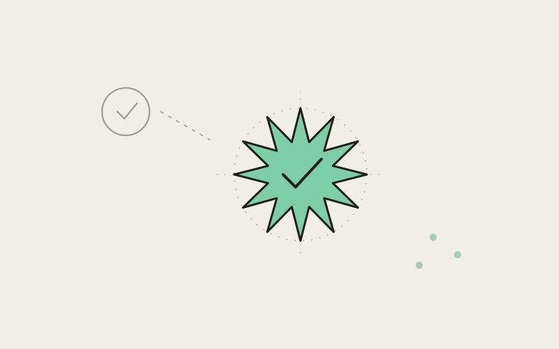
A verification badge is one of the smallest elements in an entire product, and it's doing a disproportionate amount of work for its size. At roughly the height of a lowercase letter, it has to communicate, instantly and without ambiguity, "this is a real, confirmed account" — no hover state, no tooltip, no second look. When we set out to redesign Influxx's verification badge, we didn't just want it to look nicer next to a name. We wanted it to survive the fastest, least attentive glance a person will ever give it, and still land correctly.
Why a Small Shape Carries So Much Weight
It's easy to underrate how much trust a verification badge is actually responsible for, precisely because it's small enough to seem incidental. But the badge isn't decoration sitting next to a name — for a lot of people, it's the entire basis on which they decide whether to trust what that name says. As Influxx has grown into a product where developers connect real identities to real work — shared projects, published sessions, public profiles — the badge next to a name has started carrying more weight than it used to, because more of what happens around it now depends on someone being confident they're looking at a confirmed account and not an impersonation.
That's a strange design problem, because the badge's entire job is to be looked at for a fraction of a second and correctly understood anyway. Nobody stops to study a verification mark the way they'd study a logo or a hero illustration. It gets processed in peripheral vision, at small size, often next to several other UI elements competing for the same sliver of attention. If it doesn't read clearly at that speed, it has functionally failed at its one job, no matter how considered the shape is up close.
We think that's exactly why visual trust signals deserve more design attention than their pixel footprint would suggest, not less. A large hero graphic gets forgiven for small imperfections because people linger on it. A badge gets no such grace period.
Starting From the Default: The Problem With a Plain Checkmark
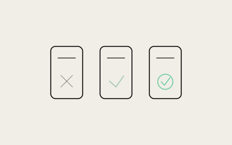
The obvious, low-risk choice for a verification mark is a checkmark inside a circle. It's familiar, it's legible, and it's exactly what a huge number of products already use — which is precisely the problem. A checkmark-in-a-circle doesn't read as "verified" anymore so much as it reads as "generic confirmation icon," because the same shape gets reused for form validation, completed checklist items, and a dozen other unrelated meanings across the products people use every day. By the time it shows up next to someone's name, it's already been diluted by every other context that shape appears in.
We wanted something that, at a glance, could only mean one thing: this account is verified. That ruled out reusing a shape whose primary association, for most people, isn't verification at all — it's "task complete" or "form valid." A badge that has to compete with its own prior associations in the viewer's head is starting from a deficit before it's even rendered.
"We put a plain checkmark circle side by side with a starburst shape at fourteen pixels and just looked at them for a while, the way you'd actually encounter either one in the product — next to a name, in a list, moving past quickly. The checkmark read as 'fine.' The starburst read as 'official.' That gap was the whole argument. We weren't choosing between two icons that both worked; we were choosing between one that was invisible and one that actually did the job."
— Devon Okafor, Design Systems Lead, Influxx
Why a Starburst
The shape we landed on is a twelve-point starburst — a form in the same general family as verification marks used by several major consumer apps, but built as its own original geometry rather than borrowed from any of them. The instinct to reach for a starburst instead of a circle-based shape isn't arbitrary. A shape with points reads as deliberately awarded rather than passively assigned. A circle is a container; almost anything can sit inside one, and a circle's own outline doesn't communicate much on its own. A starburst has to be constructed — the points, the notches between them, the symmetry — and that constructed quality is exactly what makes it feel like something that had to be earned rather than something that was just switched on.
There's also a simpler, more practical reason a starburst holds up better than a checkmark at small sizes: it has a distinctive silhouette even when you can't resolve the fine detail inside it. Squint at a checkmark-in-a-circle from across a room and it can blur into an indistinct dot. Squint at a starburst and the pointed silhouette is still legible as a shape, because the points create edge contrast a plain circle doesn't have. That silhouette-level legibility turned out to matter more than we initially expected, because so much of where the badge actually gets seen — a compact list, a busy header, a notification — is exactly the kind of low-attention, small-scale context where silhouette is doing most of the communicating.
Point Count, Weight, and How the Math Changes at Small Sizes
Once we'd settled on a starburst family of shapes, the real design work started, and most of it was about a handful of numeric decisions that sound minor in isolation and turn out to matter enormously in combination.
Point count was the first fight. We tried fewer points — eight, ten — and they consistently read as more geometric and less organic, closer to a compass rose or a decorative asterisk than a badge. We tried more — sixteen, twenty — and past a certain density the points stopped being individually resolvable at small sizes and the whole shape started to look like a slightly fuzzy circle, which defeated the entire reason we'd moved away from a circle in the first place. Twelve points turned out to be close to the sweet spot: enough points that the shape unmistakably reads as a starburst rather than a soft polygon, few enough that each point stays individually distinguishable down to the smallest size the badge actually renders at in the product.
Stroke weight and point sharpness needed a second, related adjustment once point count was settled. A starburst built from sharp, thin, needle-like points looks precise at large size and disappears at small size — the points become too thin to render cleanly once they're a handful of pixels wide, and the badge starts to look ragged instead of crisp. We rounded the outer tips slightly and thickened the base of each point relative to a "correct" mathematically sharp starburst, which is a deliberate departure from geometric purity in favor of something that actually holds its shape once it's shrunk down next to a fourteen-pixel-tall name.
"A verification badge only matters if people can trust it at a glance, which means it has to work exactly as well at the smallest size it'll ever be rendered as it does in a design file at ten times that size. We spent real time on a shape most people will never consciously look at directly, because the whole value of the thing is that it works without anyone having to look at it directly. That's a strange kind of craft to invest in, but it's the kind that actually earns trust instead of just claiming it."
— Theo Lindqvist, Founding Engineer, Influxx
The Small Craft Details That Separate "Official" From "Homemade"
The difference between a verification badge that reads as official and one that reads as a placeholder somebody drew quickly rarely comes down to the big decision — starburst versus checkmark, twelve points versus eight. It comes down to a handful of much smaller details that are easy to skip and immediately noticeable when they're wrong.
Exact Point Spacing
Uneven spacing between points is the single fastest way to make a badge look hand-drawn instead of manufactured. Human eyes are extremely sensitive to rotational symmetry breaking down, even by a small amount — a starburst where the points are spaced at slightly irregular angles doesn't read as "artisanal," it reads as "wrong," in the same way a slightly crooked picture frame reads as wrong before you consciously notice why. Every point in Influxx's badge sits at a precise, evenly repeated angle around the center, with no manual nudging of individual points to "fix" how any one of them looked in isolation. Consistency across the whole shape mattered more than any single point looking perfect on its own.
Fill Color, Not Just Outline
An outlined badge reads as lighter-weight and less final than a solid, filled one, especially at the sizes a verification mark actually renders at — outlines tend to lose definition first when something shrinks, while a solid fill holds its silhouette all the way down. We use a single, deliberately chosen fill color rather than a gradient or a multi-tone treatment, because a flat fill is the version that survives every context we render the badge in: light backgrounds, dark backgrounds, next to profile photos with wildly different color palettes. A gradient can look considered in a design mockup and inconsistent the moment it sits next to unpredictable real-world content around it.
Scaling Behavior, Not Just a Single Size
The badge doesn't exist at one size — it shows up next to a name in a compact list, inline in a header, and occasionally larger on a full profile view, and it has to hold up at all of them without being redrawn by hand for each context. That requirement is what actually drove several of the geometric decisions above. The rounded point tips and the slightly thickened point bases aren't stylistic flourishes; they're what keeps the shape from degrading into a fuzzy blob at the smallest size it needs to render at, while still looking crisp and intentional at the largest. A badge that only looks good at one specific size isn't finished — it just hasn't been tested at the sizes that actually matter yet.
"I do a double take at verification badges now because I've seen so many that are obviously just a generic check-in-a-circle icon somebody dropped in from an icon pack. Influxx's actually looks like somebody designed it on purpose — it has a distinct shape I recognize even small, next to my name in a list, without having to read anything. That sounds like a small thing to notice, but it's the kind of detail that makes the rest of the product feel considered too."
— Naomi Osei, solo indie iOS developer, Influxx user
Testing It Next to a Real Name, Not in Isolation
A badge that looks correct centered alone in a design file can still fail once it's placed where it actually lives — crowded against a name, a profile photo, sometimes a second status indicator, all competing for the same few pixels of horizontal space. We tested the final shape almost exclusively in that cluttered, realistic context rather than in isolation, because isolation is the one place the badge never actually gets seen. A shape that reads clearly against a blank canvas can still get lost or look cramped once it's squeezed next to a long name in a narrow list row, and the only way to catch that is to look at it exactly where it's going to live, over and over, at the actual sizes real screens render it at.
That process also surfaced a spacing question we hadn't anticipated going in: how much breathing room the badge needs from the text next to it before it starts to feel fused to the last letter of a name instead of a distinct, separate mark. Too little space and the badge reads as part of the name itself, blurring together into a single illegible cluster. Too much and it looks disconnected, like it belongs to something else on the row. Getting that spacing right ended up being as much a part of the design as the shape itself.
An Honest Limitation
None of this makes the badge itself the actual verification. A visual mark, no matter how carefully designed, is only as trustworthy as the process behind granting it — and a badge's job is to communicate a decision that was already made elsewhere, not to make that decision credible on its own. We've put real effort into a shape that reads clearly and can't be casually mistaken for a generic icon, but a well-designed badge sitting next to an account that shouldn't have it is still a well-designed badge in the wrong place. The craft in the shape buys legibility and a harder-to-casually-imitate visual signature; it doesn't buy, and was never meant to buy, the underlying trust decision itself. That has to hold up independently, and no amount of point-spacing precision substitutes for it.
Frequently Asked Questions
Why does Influxx use a starburst shape instead of a checkmark for its verification badge?
A checkmark-in-a-circle is one of the most overused shapes in software, reused for everything from form validation to completed checklist items, so it no longer reads as distinctly "verified" on its own. A starburst has to be visually constructed rather than just filled in, which gives it a more deliberate, awarded quality, and it keeps a distinctive, recognizable silhouette even at very small sizes.
How many points does Influxx's verification badge have, and why that number?
Twelve. Fewer points tended to read as geometric or decorative rather than official, and significantly more points became individually indistinguishable at small render sizes, blurring back into something that looked like a soft circle — the opposite of the goal.
Is Influxx's verification badge copied from another app's design?
No. It's in the same general visual family as verification marks used by several well-known consumer apps — a pointed badge shape rather than a plain checkmark — but the specific geometry, point count, spacing, and weight are original to Influxx and were iterated on independently rather than traced from an existing design.
Why does badge design matter this much for a developer tool?
Because Influxx increasingly connects real developer identities to real work — shared projects, published sessions, public profiles — and a verification badge is often the fastest, sometimes the only, signal someone has for deciding whether an account is who it claims to be. A trust signal that's easy to misread or easy to imitate isn't doing its job, regardless of how small it looks on screen.
Does the verification badge look different at different sizes in the product?
The shape itself doesn't change, but it was specifically designed and tested to hold up across the range of sizes it actually renders at, from a compact list row to a larger profile view, rather than being tuned for just one size and left to degrade elsewhere.
What color is the verification badge, and why not a gradient?
It uses a single, flat fill color rather than a gradient or multi-tone treatment. A flat fill holds its clarity consistently across the unpredictable range of backgrounds and surrounding colors it actually appears against in the product, where a gradient that looks polished in a mockup can read as inconsistent in practice.
Can a badge design alone prevent verification fraud or impersonation?
No, and we don't claim it does. The badge's job is to clearly and consistently communicate a decision that was already made through Influxx's verification process — it's a visual signal, not the underlying mechanism that decides who earns it. A well-designed badge still depends entirely on the integrity of the process that grants it.
Most people will never consciously register the choices behind Influxx's verification badge — the point count, the spacing, the slightly rounded tips that keep it from degrading at small sizes. That's not a failure of the design. It's the point. A trust signal that people have to stop and study has already lost the argument it was built to make in an instant. The measure of whether this badge succeeded isn't whether anyone notices the craft in it. It's whether, at a glance, next to a name, it just quietly means what it's supposed to mean.