You know the feeling: you open an app you use every day, tap into a screen you haven't visited in a while, and it looks like it wandered in from a different app entirely — different corners, different shadows, a font that's almost but not quite the one on the screen you just came from. Influxx Mobile just went through a restyle built specifically to avoid that feeling. About, Account, Notifications, Status, Settings, Browser Settings, and the connection log all picked up the same new glass look in one coordinated pass, not one screen quietly catching up every few months while the rest of the app looked the way it always had.
The Stitched-Together App Feeling, and Why It's So Common
Almost every app you use regularly has a version of this problem somewhere in it. A team redesigns the home screen, ships it, moves on to the next priority, and comes back to the settings screen eight months later — if it comes back at all. In the meantime you're living with an app that has two visual eras stacked on top of each other: the part that got the new treatment, and the part that's still running on whatever the app looked like a year or two ago. Nothing about that is broken, exactly. Every screen still works. But moving between them produces a small, constant flicker of dissonance — a shadow that's slightly too hard, a corner radius that's slightly too sharp, a background that doesn't quite match the one you just left.
That dissonance is easy to describe once you notice it and strangely hard to point at directly, because no single screen is wrong on its own. It only shows up in the seam between two screens that were clearly designed by two different versions of the same team, at two different points in time, with two different opinions about how things should look. Most people don't consciously register "this settings screen looks dated compared to the home screen." What they register is a vague sense that the app feels a little inconsistent, a little less considered than it could be — even though every individual piece, in isolation, looks fine.
Why We Chose One Sweep Instead of a Trickle
The easy way to avoid burning a big chunk of a release on visual work is to spread it out — restyle one screen this month, another next quarter, and let the rest catch up eventually. It's a reasonable way to manage engineering time, and plenty of good products do exactly that. We decided against it for this pass, specifically because a trickle is the mechanism that produces the stitched-together feeling in the first place. Every month you wait between restyling screen A and screen B is a month where the app has two visual eras living inside it, and the longer that stretch runs, the more obvious the seam gets.
So instead of queueing About, Account, Notifications, Status, Settings, Browser Settings, and the connection log as seven separate, spaced-out projects, we treated them as one project with seven parts, shipped together. That's a real trade-off — it's a bigger chunk of focused work to schedule at once, and it means holding several screens in your head simultaneously instead of shipping the satisfying, steady drip of "one thing polished, then the next." But the payoff is that the app doesn't spend months in between looking like two different products glued together. It goes from "the old look, mostly" to "the new look, almost everywhere" in a single step.
What Actually Moved
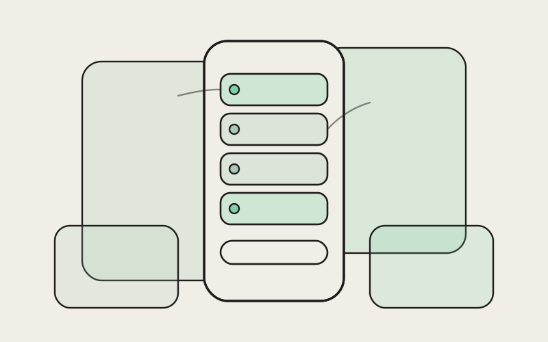
This wasn't a light touch-up. About, Account, Notifications, Status, Settings, Browser Settings, and the connection log all picked up the same underlying visual language — soft, translucent surfaces that sit like panes of glass over whatever's behind them, consistent spacing, and a shared rhythm to how information is grouped and separated. Screens that used to look like a fairly ordinary list of rows and dividers now have that layered, glassy depth to them — you can sense there's something behind the panel you're looking at, rather than every screen being one flat, opaque sheet of information stacked on the last.
Account and Settings were probably the two screens people spent the most cumulative time looking at, so getting them to feel like they belonged to the same app as the home screen mattered more than most. But the smaller, less-visited corners got the same care rather than being treated as an afterthought — the connection log, which most people only open when they're checking on something specific, looks and feels exactly as considered as the screen you land on every time you open the app.
Notifications and Status, Together
Notifications and Status ended up benefiting the most from being restyled in the same pass rather than separately, because they're screens people frequently move between in a single glance — checking status, then jumping to notifications to see what triggered it, then back. Before this pass, that back-and-forth had a small visual hitch to it, because the two screens had drifted slightly apart in look over time. Now the transition between them barely registers, which is exactly the point: you shouldn't have to notice the screen changed at all when you're just checking on something quickly.
Moving Between Screens Now
The clearest way to describe what changed is to describe what it's like to actually move around the app. Open Settings, and it looks like Notifications, which looks like your Account page — same materials, same corner treatment, same spacing rhythm, same sense of depth. Tap from one into the next and there's no visual reset, no half-second of "oh, this is the old version of the app." It reads as one continuous surface you're moving through, rather than a set of separately-designed rooms you're walking between.
That continuity is easy to undervalue until you've lived without it for a while. A consistent visual language doesn't just look nicer in a screenshot — it changes how much attention the interface asks of you while you're using it. When every screen shares the same rules, you stop having to re-orient every time you land somewhere new, because the panel shapes, the spacing, the way information is grouped are all already familiar. Your attention stays on whatever you actually opened the app to do — checking a build's status, glancing at a notification, adjusting a setting — instead of on the interface itself.
"The easiest way to make an app feel high-quality has nothing to do with adding a single new feature. It's making sure the fortieth screen someone opens feels exactly as considered as the first one. People don't usually praise consistency out loud, but they absolutely notice its absence — that faint sense that some corner of the app got less care than the rest. Doing this as one sweep instead of a trickle was the only way to avoid ever putting that feeling in front of someone."
— Devon Okafor, Design Systems Lead, Influxx
There's also a quieter benefit that only shows up once you've used the new version for a week or two: the app stops feeling like it has a "front" and a "back." A lot of apps put their best design work into the two or three screens people see the most, and let everything else lag behind — as if the home screen is the storefront and settings is the stockroom. Restyling almost everything at once erases that hierarchy. There's no obviously neglected part of the app anymore, no screen that feels like it's just there to be functional while the "real" design happened somewhere else.
What Didn't Change
None of this touched how anything actually works. Where a button was, what a setting does, how you get from one screen to the next — all of that is exactly where you left it. This was a visual pass, not a rework of the app's structure, on purpose. Relearning where things live is its own kind of friction, and we didn't want to trade "the app looks inconsistent" for "the app looks great but now I have to relearn my own settings screen." If you knew your way around Influxx Mobile before this, you still do. The screens just look like they belong to the same app now.
"I hadn't opened the connection log in months, honestly — it's one of those screens you only visit when something specific sends you there. When I finally did after this update, I half expected it to still look like the old version, the way that kind of screen usually does. It didn't. It looked exactly like the Account page I'd just come from, same feel, same everything. That's a small thing to notice, but it's the kind of small thing that makes an app feel like someone's actually paying attention to it."
— Dana Osei, engineering manager at a health-tech startup and Influxx user
The Honest Part: A Few Corners Are Still Catching Up
We'd rather say this plainly than let you discover it yourself and wonder if we missed it: a sweep this size, done in one coordinated pass, still doesn't reach every single screen in the app. Almost everything moved together — About, Account, Notifications, Status, Settings, Browser Settings, and the connection log — but a handful of less-visited corners, the kind of screens most people open rarely if ever, are still on the older look and will catch up in a following pass. We could describe this update as "every screen in the app," and it would be close enough that most people would never notice the gap. We'd rather tell you the gap exists than let you find one of those screens on your own and start wondering what else got skipped.
The reason we're comfortable shipping the sweep now rather than waiting to catch every last screen is that the screens people actually spend time in are the ones that moved. The ones still waiting are genuinely the corners of the app you'd have to go looking for. But "genuinely rare to visit" isn't the same as "doesn't matter," and we'd rather set that expectation honestly than have the update feel less finished than it actually is once someone stumbles onto one of the remaining screens.
Frequently Asked Questions
Which screens got the new glass look in Influxx Mobile?
About, Account, Notifications, Status, Settings, Browser Settings, and the connection log all moved to the new visual treatment in this single pass. That covers the screens people spend the most time in, plus several less-visited ones that would have otherwise been left looking dated for a long time.
Did this update change how any settings or features work?
No. This was a visual restyle, not a change to functionality. Every button, setting, and screen does exactly what it did before — the layout, materials, and visual rhythm are what changed, not the underlying behavior. If you knew your way around the app before, nothing about navigating it should feel unfamiliar now.
Why do some apps restyle one screen at a time instead of all at once?
It's usually a scheduling decision — restyling one screen per release is easier to plan around than committing a large chunk of time to several screens at once. It's a completely reasonable trade-off for a lot of teams. We chose the opposite approach here specifically because a long trickle is what produces the feeling of an app stitched together from two different eras, and we wanted to avoid that stretch entirely rather than manage it gracefully.
Is every screen in the app now using the new design?
Almost every one, but not literally all of them. A small number of rarely-visited screens are still on the previous look and will get the same treatment in a following pass. We're saying this plainly rather than implying the whole app is finished, because it isn't quite — it's very close.
Will this restyle affect app performance or battery life?
No noticeable difference either way. This was about how screens look and feel to move between, not about anything that runs in the background or affects how the app performs day to day.
Do I need to update anything or change a setting to see the new look?
No. Once you're on the current version of Influxx Mobile, every restyled screen already looks this way — there's no toggle to find or setting to turn on.
Why does visual consistency across screens actually matter, beyond looking nicer?
A consistent look reduces how much your attention gets pulled toward the interface itself. When every screen shares the same materials and rhythm, you don't have to mentally re-orient each time you land somewhere new — your attention stays on whatever you actually opened the app to check, rather than on adjusting to a screen that looks like it belongs to a different app.
The moment you notice an app is stitched together from two different eras is usually small and easy to shrug off — a slightly different shadow here, a corner that doesn't quite match there. It's also, once you notice it, hard to unsee. Doing this restyle as one deliberate sweep instead of a slow trickle was our attempt to make sure that moment never shows up in Influxx Mobile — that wherever you tap next, it feels like the same considered app you were just using, not a different one wearing the same name.